

IN THIS ARTICLE:
Key Takeaways
1
Landing page best practices start with one rule: match the ad promise exactly, every time.
2
92% of PPC clicks don't convert, and the landing page is almost always the reason why.
3
A 1-second load delay reduces conversions by 7%. Speed is a conversion lever.
4
52% of B2B companies send Google Ads traffic to their homepage. That's expensive.
5
Pages loading under 2 seconds convert at 9.6% versus 3.3% at 5 seconds.
You've spent hours perfecting your PPC ads. Your targeting is razor-sharp, your ad copy sparkles, and your bid strategy would make even seasoned marketers jealous. But here's the brutal truth: 92% of PPC ads get clicked and end up with no conversion. That's right for every 100 clicks you're paying for, 97 visitors are bouncing without taking action. The culprit? Your landing page is fumbling the handoff.
Think of your PPC campaign like a relay race. Your ad is the first runner who sprints ahead and passes the baton to your landing page. But if that second runner stumbles, drops the baton, or runs in the wrong direction, all that earlier effort becomes wasted energy. Your landing page isn't just another webpage; it's your conversion engine, and it needs to be built like one.
In this guide, we're diving deep into the proven strategies that separate high-converting landing pages from expensive disappointments. You'll discover data-backed best practices, updated statistics from 2024-2026, and actionable insights that go beyond generic advice. Let's turn those clicks into customers.
Understanding Landing Page Performance in 2026
The median conversion rate for landing pages sits at 6.6% across all industries as of Q4 2024, based on analysis of 41,000 landing pages with 464 million visitors. However, the best performers are converting at 11.45% or higher. Understanding what separates these high-converting pages from underperformers is the key to maximizing your PPC investment.
Financial services leads with an 8.4% median conversion rate, showing a 27% advantage over the baseline. Webinar landing pages achieve a remarkable 22.3% conversion rate compared to the typical 10.76% across all page types. The pharmaceutical industry sees mobile conversion rates exceeding 32%, while travel lags behind at 16.35%.
These benchmarks matter because they help you set realistic goals and identify where your pages stand relative to competitors. If you're in media converting at 10%, you're underperforming against the 11.3% industry median. Conversely, if you're in B2B services hitting 8%, you're doing exceptionally well against the 4-6% typical range.
The Foundation: Perfect Message Match Between Ads and Pages
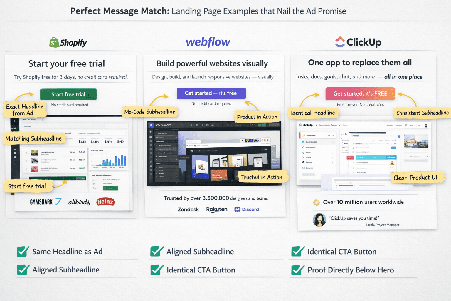
Let's address the elephant in the room first. 52% of PPC ads by B2B companies direct traffic to their home pages rather than dedicated landing pages. This represents one of the costliest mistakes in digital advertising.
When someone clicks your ad promising "50% Off Annual Plans," they expect to see that exact offer immediately upon arrival. Any disconnect creates friction, confusion, and abandonment. Your landing page headline, body copy, and visual elements must reinforce precisely what the ad promised.
Writing the perfect, search-intent driven landing page copy requires disciplined consistency. Your headlines should mirror your ad copy word-for-word. If your Google Ad headline says "No Credit Card Required," your landing page headline should echo this promise prominently. This isn't the place for creative interpretation or clever wordplay.
Visual language matters equally. Use similar colors, imagery, and design elements between your ad and landing page to create a seamless transition. This visual continuity signals to visitors they've landed in the right place and made a good click.
Tone consistency matters more than most marketers realize. If your ad voice is casual and friendly, switching to corporate jargon on your landing page creates cognitive dissonance that erodes trust. Maintain the same personality throughout the entire customer journey.
Incorporate the exact keywords from your PPC campaign into your landing page copy naturally. This approach not only improves relevance for visitors but can also improve your Quality Score and lower cost-per-click over time.
For campaigns running multiple ad variations with different headlines, consider creating variant pages or using Dynamic Text Replacement technology. This allows your landing page headlines to automatically match the search query that triggered your ad, creating perfect message alignment at scale.
Speed Optimization: The Silent Conversion Killer
Here's a statistic that should make you panic in a productive way: 53% of mobile users will abandon a page if it takes more than 3 seconds to load. Three seconds. That's less time than it takes to read this sentence aloud.
The impact compounds quickly. Just a 1-second delay in page load time can reduce landing page conversions by 7%. Think about the cascading effect. If your page takes 5 seconds instead of 2 seconds to load, you're potentially losing 21% of your conversions before anyone even sees your offer.
The speed-to-conversion relationship is stark and unforgiving. Landing pages that load in under 2 seconds enjoy a 30% higher conversion rate compared to slower pages. Meanwhile, pages loading within 2 seconds achieve a 9.6% conversion rate, while those loading within 5 seconds drop precipitously to just 3.3%.
Image optimization represents the fastest path to speed improvements for most landing pages. Compress all images aggressively and convert them to WebP format when possible. This modern image format provides superior compression without visible quality loss.
Minimize JavaScript and CSS files by removing unused code and combining multiple files. Every external script request adds latency to your page load time. Audit your third-party scripts ruthlessly and remove anything non-essential to the conversion goal.
Browser caching allows repeat visitors to load your page faster by storing static resources locally. Configure your server to enable caching for images, CSS files, and JavaScript.
Content Delivery Networks distribute your page assets across global servers, reducing latency for visitors regardless of geographic location. For campaigns targeting multiple regions, CDNs provide measurable speed improvements.
Consider implementing Accelerated Mobile Pages for mobile traffic. AMP delivers near-instant load times by stripping away non-essential elements and pre-rendering content. For mobile-heavy campaigns, AMP can dramatically improve conversion rates.
Test your page speed regularly using Google PageSpeed Insights and aim for scores above 85. The tool provides specific recommendations for improvement based on your page's actual performance.
Remember that every millisecond counts when you're paying for traffic. Speed optimization isn't optional; it's fundamental to conversion success.
Mobile-First Design: Where 83% of Your Traffic Lives
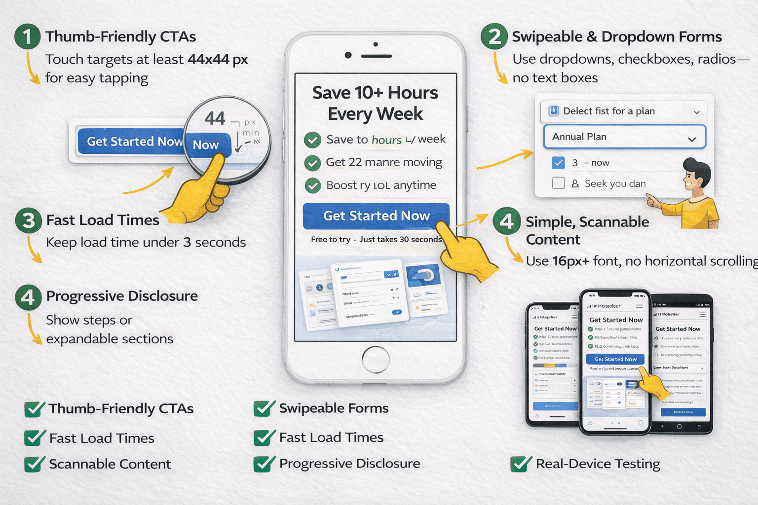
Here's a reality check that reshapes everything: 82.9% of all landing page visits happen on mobile devices. Yet many marketers still design for desktop first and treat mobile as an afterthought. This approach is backwards and costly.
Interestingly, visitors using desktop computers maintain a slightly higher average conversion rate at 12.1% compared to mobile's 11.2%. However, with such overwhelming mobile traffic volume, optimizing for mobile becomes non-negotiable regardless of per-device conversion rates.
Mobile optimization begins with form design. Mobile users resist typing essay-length responses on small keyboards. Replace text fields with dropdown menus, checkboxes, and radio buttons wherever possible. Each form field represents a conversion barrier, and that barrier grows exponentially larger on mobile devices.
Call-to-action buttons need to be thumb-friendly on mobile screens. Apple recommends minimum touch targets of 44x44 pixels to prevent frustration and mis-taps. Position these buttons where thumbs naturally rest on mobile screens rather than forcing awkward reaches.
Horizontal scrolling represents an instant credibility killer on mobile. Your content should fit naturally within mobile screen widths without requiring users to scroll sideways. Test your pages on multiple device sizes, not just the latest iPhone or flagship Android device.
Progressive disclosure helps prevent mobile overwhelm. Instead of displaying everything at once, reveal information progressively using expandable sections, tabs, or multi-step processes. This approach makes content consumption easier on constrained screen sizes.
Font sizes matter more on mobile than desktop. Use a minimum of 16 pixels for body copy to ensure readability without zooming. Headings should scale proportionally to maintain visual hierarchy on smaller screens.
Test your landing pages on actual mobile devices, not just desktop browser emulators. Real-world testing reveals issues that simulations miss, from touch responsiveness to readability in various lighting conditions.
The Psychology of Form Design: Why Less Converts More
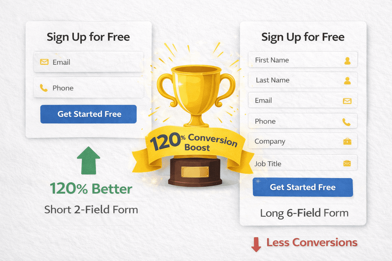
Forms represent where good intentions transform into abandoned sessions. The data is unequivocal: landing pages with 5 or fewer fields convert 120% better than longer forms. This isn't a minor improvement; you can more than double your conversion rate simply by asking for less information upfront.
Each additional field beyond 5 represents a 20-30% conversion penalty. The psychological burden of completing forms grows exponentially, not linearly. Six fields don't feel slightly worse than five; they feel significantly more burdensome.
However, context matters more than absolute rules. High-value B2B offerings can successfully use 7-10 fields when qualifying serious buyers. The key is matching form length to the perceived value of your offer. A $50,000 enterprise software solution justifies more questions than a free ebook download.
Landing pages asking for just an email and phone number achieve the best conversion rate at 10.15%. Forms requesting birth dates or gender see conversion rates drop to 5-6%, suggesting certain information types trigger privacy concerns.
Multi-step forms provide a strategic solution when you need to collect extensive information. Instead of presenting 10 fields simultaneously, break them into 2-3 steps. Progressive disclosure reduces perceived effort and increases completion rates dramatically.
The sequence of questions matters psychologically. Start with easy, non-threatening questions like name and email before progressing to more sensitive topics like budget or company size. This graduated approach builds momentum and commitment.
Smart field design reduces typing effort and friction. Enable autofill functionality, use smart defaults based on previous interactions, and implement input masks for structured data like phone numbers. On mobile, ensure the appropriate keyboard type appears automatically: numeric keyboards for phone numbers, email keyboards for email addresses.
Visual progress indicators become essential for multi-step forms. Show users where they are in the process to reduce uncertainty and abandonment. A simple "Step 2 of 3" indicator can significantly improve completion rates.
Remove non-essential fields ruthlessly. Challenge every single field with the question: "Do we absolutely need this information before conversion?" Remember, you can always gather additional information after the initial conversion through email nurture sequences or account setup processes.
Copywriting That Converts: Simplicity Beats Complexity
Most marketers overthink their copy. They deploy industry jargon, construct complex sentences, and use college-level vocabulary to sound professional. This approach kills conversions systematically.
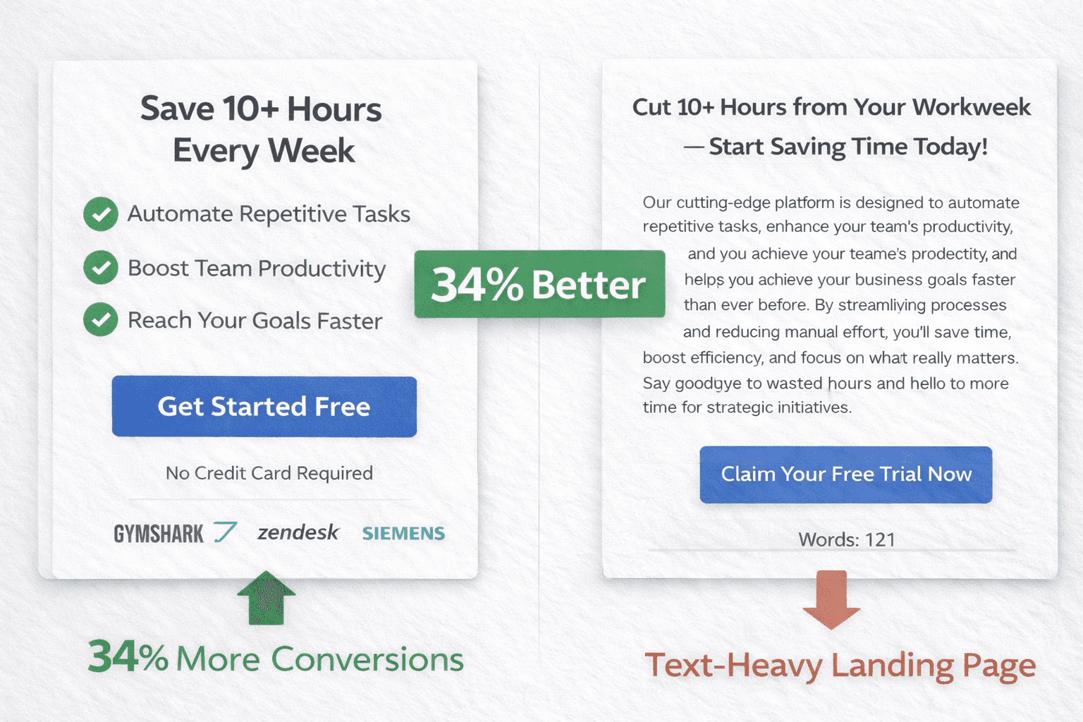
Landing pages with copy at a 5th-7th grade reading level achieve an 11.1% conversion rate versus 5.3% for college-level copy. That's a 109% improvement from simply writing more clearly. The lesson? Simplicity wins every single time.
Why does simple copy outperform? Attention spans have decreased to just 47 seconds in 2024, down dramatically from 2.5 minutes in 2004. People scan rather than read. They skim rather than study. Your copy must accommodate this reality.
Start with one clear promise delivered in 10 words or fewer. Your headline should communicate the core benefit instantly, not what you do but what problem you solve. "Save 10 Hours Per Week on Email" beats "Advanced Email Management Platform" decisively.
Focus relentlessly on benefits rather than features. Don't describe "cloud-based data synchronization." Instead, promise visitors they can "access your files from anywhere, instantly." The difference seems subtle but impacts conversion rates measurably.
Address objections proactively before they solidify into reasons not to convert. Include FAQ sections, guarantee information, and trust signals that remove hesitation. When you anticipate and answer questions, you prevent abandonment.
Landing pages with minimal text and clear calls-to-action convert 34% better than text-heavy pages. This doesn't mean stripping away all copy, but rather being ruthlessly selective about what you include. Every word should earn its place by moving visitors closer to conversion.
Write in active voice rather than passive constructions. "Our software reduces costs by 30%" feels more compelling than "A 30% cost reduction can be achieved with our software." Active voice creates energy and momentum.
Use short, punchy sentences that maintain reading flow. Long, meandering sentences force readers to work harder to extract meaning. On landing pages, cognitive effort correlates directly with abandonment rates.
Test your copy with people unfamiliar with your business. Ask them to read your headline and supporting copy, then explain what you're offering and what problem you solve. If they can't answer clearly and quickly, your copy likely isn't effective.
Social Proof: Turning Skeptics into Believers
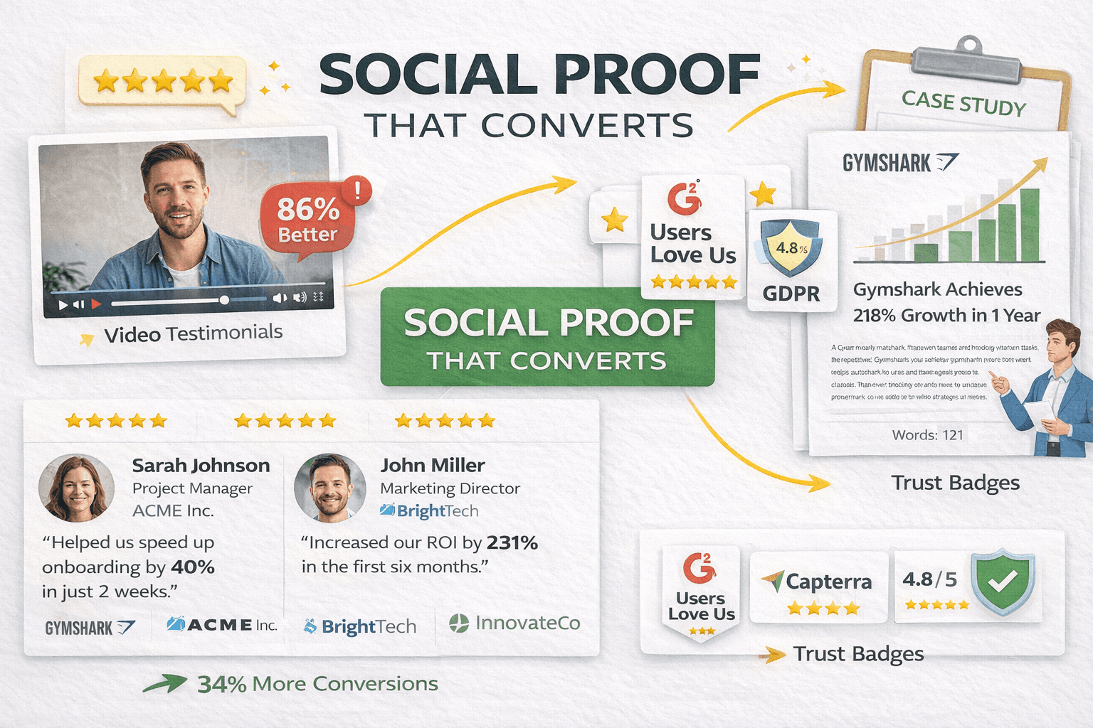
Nobody trusts your marketing claims anymore. They've heard exaggerated promises too many times. But they do trust other customers. Research shows 92% of consumers read testimonials when considering purchases, making social proof essential rather than optional.
However, not all social proof delivers equal impact. Video testimonials outperform text by 80-86% because they create emotional connection and authenticity that written words struggle to match. Seeing and hearing a real person describe their positive experience builds trust in ways that text testimonials cannot replicate.
Generic testimonials from "Satisfied Customer" or anonymous sources carry zero credibility. Include full names, job titles, company names, photos, and specific results achieved. The more identifying details you provide, the more trustworthy the testimonial becomes.
Quantify results whenever possible. "This software saved us time" represents weak social proof. "We reduced processing time by 47% in the first month" delivers powerful, specific validation. Numbers make testimonials concrete and believable.
Match testimonials to common objections strategically. If speed concerns frequently arise, showcase testimonials emphasizing fast implementation. If price represents a sticking point, highlight ROI stories from customers who achieved rapid payback.
Mix multiple social proof formats to appeal to different visitor preferences. Combine written testimonials, video reviews, case study snippets, and trust badges. Some visitors connect with video, others prefer reading detailed case studies.
Display real-time activity notifications to create urgency and social validation. Messages like "Sarah from Austin just signed up" or "23 people viewing this offer" leverage FOMO (fear of missing out) psychology effectively.
Include recognizable client logos when possible. If major brands use your product or service, their logos serve as powerful endorsement even without explicit testimonials. Brand association transfers credibility.
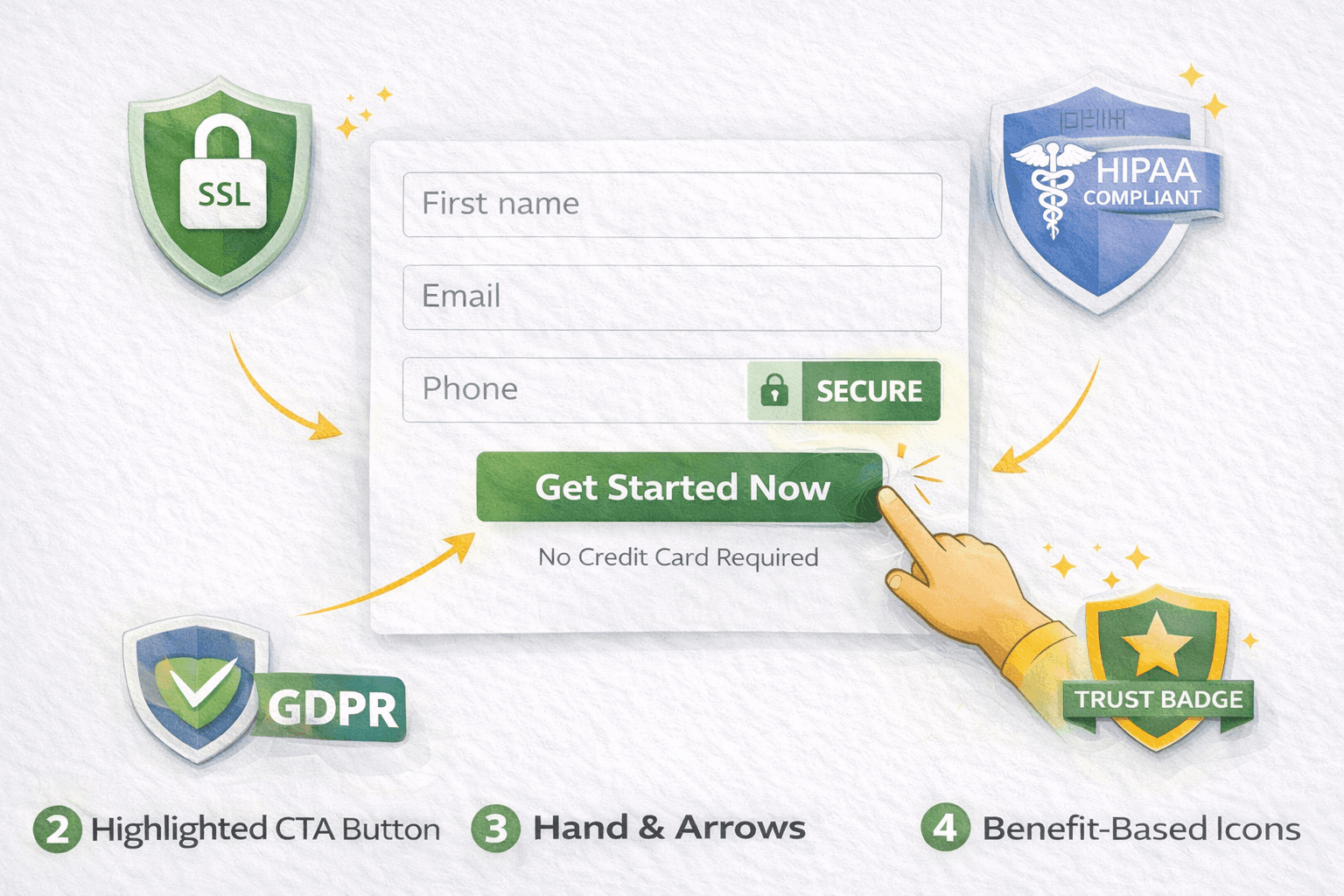
Trust badges and certifications provide institutional social proof. Display SSL certificates, industry certifications, compliance badges like GDPR or HIPAA, and payment security icons prominently to build confidence.
Reviews and ratings aggregate social proof at scale. Display star ratings, total review counts, and testimonial highlights from third-party review platforms like G2, Capterra, or Trustpilot. Third-party validation carries more weight than self-selected testimonials.
Navigation Removal: Embracing Single-Focus Design
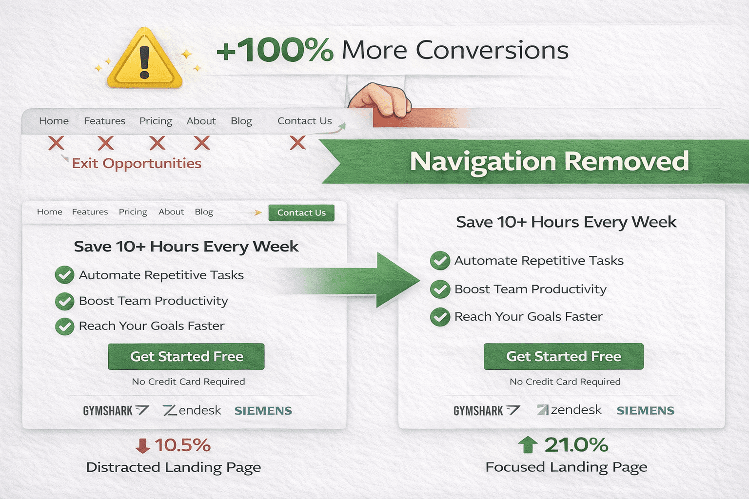
Here's a controversial statement backed by compelling data: navigation menus kill conversions. Stripping a landing page of its navigation can double conversion rates. This seems counterintuitive until you understand the psychology.
Landing pages with a single call to action achieve an average conversion rate of 13.5%, compared to 11.9% for pages with two to four CTAs and 10.5% for pages with more than five CTAs. The data reveals a clear pattern: focus wins, distraction loses.
Every link represents an exit opportunity. When you include site navigation, footer links to other pages, sidebar widgets, or multiple competing calls-to-action, you're essentially providing visitors with escape routes from your conversion goal.
Your landing page exists for one purpose: driving conversions. Every element should support that goal or be removed. This represents a fundamentally different philosophy than your website's other pages, which serve multiple objectives like exploration, education, and general navigation.
Remove main navigation menus entirely. Visitors arrived from a specific ad with a specific intent. They don't need to browse your about page or blog articles. They need to decide whether your offer solves their problem.
Eliminate footer links to other website pages. While footers can include essential elements like privacy policies and contact information, they shouldn't provide pathways to wander away from the conversion goal.
Limit outbound links to absolutely essential resources only. Every link you include should directly support the conversion decision, not offer tangential information or alternative paths.
Use one primary call-to-action throughout your page. You can repeat this CTA multiple times at strategic points, but maintain singular focus on one conversion action. Don't ask visitors to simultaneously download a guide, schedule a demo, and subscribe to your newsletter.
Turn off automatic popup forms and chat widgets that compete for attention. While live chat can increase conversions when implemented strategically, poorly timed popups create distraction and annoyance.
Remove social media feeds and widgets. Your landing page isn't the place for your latest tweets or Instagram posts. Social sharing buttons for visitors to share your page can work, but feeds that divert attention hurt conversions.
Visual Hierarchy and Directional Cues
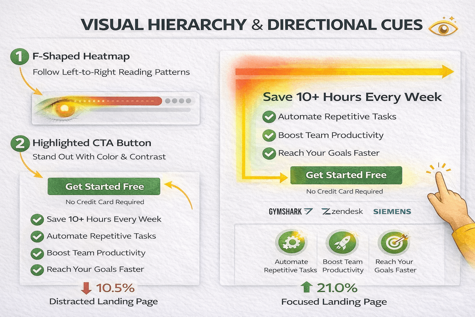
Human eyes follow predictable patterns when scanning web pages. Smart marketers leverage this psychology to guide attention exactly where they want it. Understanding and implementing effective visual hierarchy separates high-converting pages from mediocre performers.
The term "above the fold" describes what visitors see before scrolling. This prime real estate deserves careful attention. Keep your headline, unique value proposition, and primary call-to-action highly visible without scrolling.
However, cramming everything above the fold creates clutter that obscures your message. Balance visibility with clarity. Ensure visitors see your core offer and next step immediately, but give these elements room to breathe.
Screen resolutions vary dramatically across devices. Design for the devices most visitors actually use rather than your state-of-the-art equipment. Check your analytics to understand your audience's device distribution, then optimize accordingly.
Directional cues guide eyes toward your call-to-action through both literal and subtle methods. Arrows and pointing icons provide explicit direction, while other techniques work more subtly.
Images of people looking toward your CTA leverage our natural tendency to follow gaze direction. When a photo shows someone looking at your form or button, visitors unconsciously follow that line of sight.
Color contrast makes calls-to-action pop from surrounding elements. Your CTA button should use colors that contrast sharply with your background. Use color strategically to create visual hierarchy and draw attention to conversion points.
Button design matters more than many marketers realize. Buttons should look unmistakably clickable through proper sizing, shadowing, and styling. Visitors shouldn't need to guess what's interactive.
Layout and whitespace create visual flow that guides visitors through your content naturally. Strategic spacing between sections creates breathing room and prevents overwhelming visitors with information density.
Animations can draw attention to key elements when used sparingly. Subtle motion catches the eye and directs focus, but excessive animation creates distraction and annoyance. Less is more with landing page animations.
Trust Signals: Building Instant Credibility
When visitors land on your page, they're asking one critical question: "Can I trust this?" You have seconds to answer convincingly. Trust signals provide the evidence visitors need to overcome natural skepticism.
Security badges and certifications demonstrate your commitment to protecting customer information. Display SSL certificates prominently, especially near forms where visitors enter personal data. Industry certifications and compliance badges like GDPR, HIPAA, or PCI DSS build institutional trust.
Media mentions and press coverage provide third-party validation. If reputable publications have featured your company, display those logos prominently. Media association transfers credibility through implied endorsement.
Client logos from recognized brands work similarly. If major companies use your product or service, their logos serve as powerful social proof even without explicit testimonials. Association with respected brands elevates your perceived credibility.
Transparent contact information signals legitimacy and accountability. Include a physical address, phone number, and multiple contact methods. Companies hiding their contact information trigger suspicion, while those displaying it openly project confidence and trustworthiness.
Money-back guarantees and satisfaction policies reverse risk for customers. Clearly state your return policy, satisfaction guarantee, and what happens if customers aren't happy. Risk reversal makes the conversion decision feel safer.
Privacy assurance has grown increasingly important as data concerns escalate. Link to your privacy policy and explicitly state you won't sell or share customer information. Brief privacy statements near forms can significantly improve conversion rates.
Award badges and industry recognition provide independent validation of your quality and expertise. Display relevant awards, certifications, and industry rankings that demonstrate your standing in your field.
Lead Generation Landing Page Strategies
Lead capture pages face unique challenges because they ask visitors to exchange personal information for value. These pages require special attention to balance information gathering with conversion optimization.
Multi-step forms dramatically reduce perceived effort when collecting extensive information. Instead of presenting 15 fields on a single page, spread them across 2-3 steps. This progressive disclosure approach feels less overwhelming and increases completion rates substantially.
Start each multi-step form with easy, non-threatening questions. Ask for name and email first before progressing to more sensitive topics like budget, company size, or specific challenges. This graduated approach builds momentum and commitment through the completion process.
Progress indicators reduce abandonment in multi-step forms. Simple visual cues like "Step 2 of 3" help visitors understand where they are in the process and how much effort remains. This transparency reduces uncertainty and encourages completion.
Avoid manual entry whenever possible. Choosing from a dropdown menu requires less cognitive effort than typing. Replace text fields with dropdowns, radio buttons, or checkboxes for any predefined options.
Smart defaults and autocomplete functionality reduce typing burden. Enable browser autofill, implement input masks for structured data like phone numbers, and use appropriate mobile keyboard types automatically.
Privacy policies have become non-negotiable for lead generation forms. Link to your privacy policy prominently and explain clearly how you'll use submitted information. Compliance with GDPR, CCPA, and other regulations isn't just legal necessity; it builds trust.
Value exchange clarity matters enormously. Make the benefit of form completion crystal clear. "Download our free guide" communicates value better than generic "Submit" button copy.
Thank you pages create opportunities beyond simple confirmation. When visitors complete your form, use a dedicated thank you page to confirm submission, set expectations for next steps, and potentially offer additional resources or conversion opportunities.
Advanced Personalization Tactics
Personalization can improve landing page conversions by 202% by making each visitor feel like the page was created specifically for them. Dynamic landing pages that automatically adapt based on user data convert 25.2% more mobile users compared to static alternatives.
Dynamic Text Replacement matches landing page headlines and copy to the exact keywords visitors searched for in their PPC ads. This creates perfect message match at scale without building hundreds of individual landing pages.
Geographic customization shows location-specific images, addresses, phone numbers, or special offers based on visitor location. Regional personalization creates relevance and local connection that generic pages cannot match.
Traffic source adaptation customizes messaging based on whether visitors arrived from Google Ads, Facebook, LinkedIn, or other channels. Different traffic sources indicate different levels of intent and awareness that personalized landing pages can address.
Returning visitor recognition allows you to show different content to return visitors versus first-time visitors. Someone visiting for the third time might benefit from different messaging than someone just discovering your offer.
Device-specific optimization goes beyond responsive design to actually change your offer or messaging based on device type. Mobile visitors might respond better to different offers than desktop users.
Industry-specific variations for B2B campaigns allow you to customize case studies, testimonials, and messaging to match each visitor's industry when that information is available through ad targeting or form data.
Account-based marketing personalization takes customization to the extreme by creating individualized experiences for target accounts. When pursuing high-value enterprise deals, the ROI of custom landing pages often justifies the investment.
A/B Testing: The Path to Continuous Improvement
Best practices provide starting points, but your specific audience might behave differently than aggregate benchmarks suggest. Marketers who regularly A/B test their landing pages experience a 37% increase in conversions compared to those who don't.
Yet only 17% of marketers actively A/B test their landing pages, meaning 83% are leaving money on the table through optimization neglect.
Effective testing requires disciplined methodology. Test one variable at a time to clearly attribute results. If you change the headline AND the CTA color AND the form length simultaneously, you cannot determine which change drove results.
Let tests run until you achieve statistical significance, typically 95% confidence level. Don't call winners after 50 conversions. Account for weekly traffic patterns by running tests through complete weeks to avoid day-of-week biases.
Test bold differences rather than minor variations. Don't waste time testing light blue versus dark blue CTA buttons. Instead, test fundamentally different approaches: long-form versus short-form pages, video versus static images, problem-focused versus benefit-focused headlines.
Document every test in a testing log that records what you tried, results achieved, and insights learned. Patterns emerge over time that inform future strategy and help you understand your audience's preferences.
Start testing with elements that have the biggest potential impact rather than minor details. Headlines, calls-to-action, form length, and page layout typically deserve testing priority over font choices or minor color variations.
Use proper A/B testing tools rather than relying on gut feeling or anecdotal feedback. Tools like Google Optimize, VWO, or Optimizely provide statistical rigor and prevent false conclusions from limited data.
Remember that optimization never ends. Even high-performing pages can improve through continued testing. The best marketers treat landing page optimization as an ongoing process rather than a one-time project.
Common Mistakes That Destroy Conversions
Understanding what not to do can be as valuable as knowing best practices. These common mistakes systematically destroy conversion rates.
Asking for excessive information represents the most frequent conversion killer. Every form field beyond what's absolutely necessary creates friction and abandonment. Be ruthless about limiting fields to true essentials.
Slow load times have no excuse in 2026. If your page takes more than 3 seconds to load, you're losing more than half your potential conversions before visitors even see your offer.
Mobile unfriendliness kills conversions from 83% of your traffic. Testing only on desktop while ignoring mobile optimization is marketing malpractice in the current environment.
Generic stock photos featuring overly-posed corporate scenes and handshake images hurt more than help. These artificial images signal low effort and reduce credibility. Use authentic images showing real customers and actual product usage.
Hidden contact information triggers immediate suspicion. If visitors cannot easily find how to reach you, they'll assume you're hiding something or running a scam. Display contact information prominently.
Confusing navigation with multiple CTAs, excessive links, and unclear next steps creates decision paralysis. When visitors face too many choices, they often choose nothing.
Mismatched messaging between ads and landing pages breaks trust before it forms. If your ad promises one thing and your landing page delivers something different, you've wasted that click spend.
Missing social proof leaves your claims unsupported and unbelievable. Include testimonials, reviews, case studies, and trust signals throughout your landing page.
Your Action Plan for High-Converting Landing Pages
Creating high-converting landing pages for PPC campaigns requires understanding core principles and testing relentlessly with your specific audience. The difference between a 2% conversion rate and a 10% conversion rate isn't magic; it's disciplined execution of proven practices combined with continuous optimization based on real data.
Start with perfect message match between your ads and landing pages. Ensure headlines, copy, and visual elements reinforce exactly what your ad promised. Any disconnect creates immediate friction that tanks conversions.
Prioritize speed optimization ruthlessly. Get load times under 3 seconds at minimum, aiming for under 2 seconds. Every millisecond counts when you're paying for traffic.
Design for mobile first since 83% of your traffic comes from mobile devices. Make forms simple, buttons thumb-friendly, and content easily consumable on small screens.
Simplify forms to 5 fields or fewer whenever possible. Every additional field represents a 20-30% conversion penalty. Collect only what you absolutely need before conversion.
Add authentic social proof throughout your landing page. Real testimonials from real people with specific, quantified results build trust that marketing claims cannot match.
Remove navigation and distractions to maintain single-focus design. Every link is a potential exit. Keep visitors focused on your one conversion goal.
Use clear, simple copy written at a 5th-7th grade reading level. Complex vocabulary and jargon reduce conversions by more than 50% compared to simple language.
Design with visual hierarchy that guides eyes toward your call-to-action. Use contrast, spacing, directional cues, and strategic layout to create clear visual flow.
Test continuously using proper A/B testing methodology. Let data guide decisions rather than opinions or assumptions. Even high-performing pages can improve through ongoing testing.
Your PPC budget is too valuable to waste on landing pages that fumble conversions. Implement these practices systematically, monitor performance religiously, and optimize relentlessly. The relay race between your ad and landing page doesn't have to end in dropped batons. With disciplined execution, you can create seamless handoffs that carry visitors all the way to conversion and transform clicks into customers.
The Bottom Line
You can have the best ads and targeting in the world, but if your landing page doesn’t deliver a clear message, build trust, and make it easy to take action, people will leave.
The good news? Scalix AI has been helping B2B SaaS companies fix that.
Our PPC management services believe small changes can make a big difference. We focus on clarity, keeping things simple, aligning the copy with the search intent, and always test what works. Get your free audit today!
What makes a landing page high-converting for PPC campaigns?
Why is message match between PPC ads and landing pages so important?
How fast should a PPC landing page load to maximize conversions?
How many form fields should a PPC landing page have?
What are the biggest landing page mistakes that hurt PPC conversion rates?
