

IN THIS ARTICLE:
Key Takeaways
1
Call to action examples prove one thing: vague CTAs destroy conversions that good ads earned.
2
Every CTA must answer three silent questions: what do I get, is it worth it, and what's next.
3
Mismatched CTAs between ad and landing page break the conversion before the page loads.
4
A CTA should appear after value is delivered, not before the visitor has a reason to act.
5
"Submit" and "Click Here" are not CTAs; they're friction dressed up as direction.
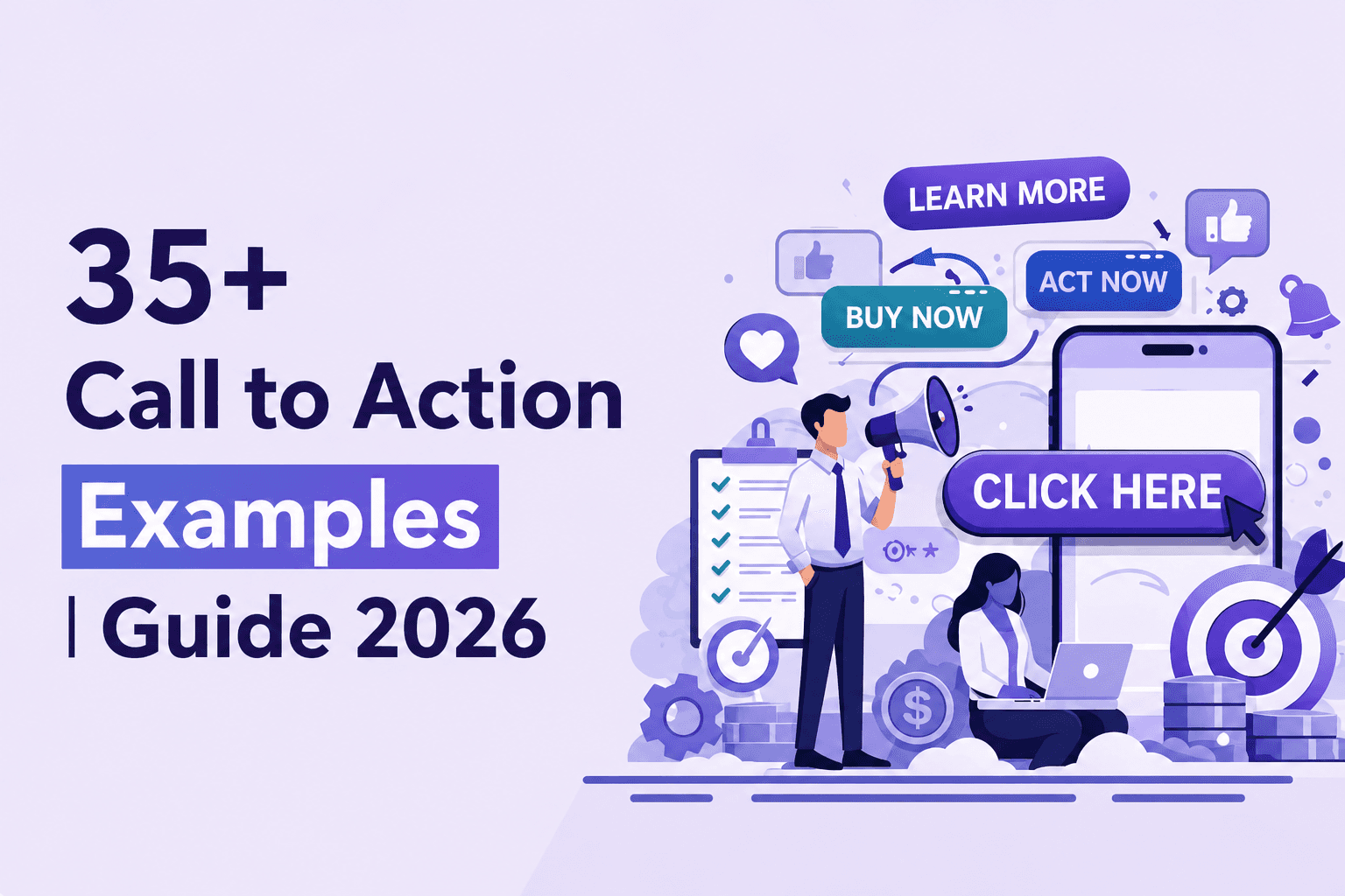
Call-To-Action Examples are where conversions actually happen. Traffic, impressions, and clicks mean very little if the call to action does not move someone to take the next step. Many campaigns underperform not because the offer is weak, but because the CTA is unclear, passive, or asking for too much too soon.
Teams often invest heavily in ads, targeting, and landing page design, yet treat the call to action as a small detail. In reality, high-converting CTAs shape user behavior. The right message at the right stage of the funnel can turn interest into a booked demo, a trial signup, or a qualified lead.
For SaaS and growth-focused companies, a call to action is not just a button. It is a strategic decision point. The wording, timing, placement, and value behind it directly influence conversion rates.
Let’s break down practical Call-To-Action Examples that drive real results, along with when and how to use them effectively.
What Is A Call To Action (CTA)?
A Call To Action (CTA) is a clear instruction that tells a user what to do next. It can appear as a CTA button, a short line of persuasive copy, or even a headline that guides decision-making.
The purpose of a CTA is not simply to drive clicks, but to move someone from interest to action by design.
In performance marketing, especially within a strong Google Ad strategy, the CTA is not an afterthought. It is there to connect the ad message to the landing page experience. So, if the CTA in your ad promises one outcome but the CTA button on your landing page asks for something different, conversion will drop.
Your message, search intent, and action should all be aligned for the campaign to work.
A well-written CTA should reduce hesitation. It should make the next step feel clear, logical, and low-risk.
A Standard CTA Design Format
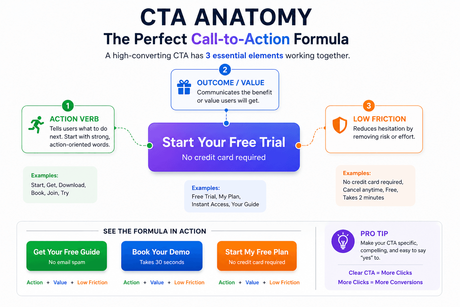
A high-performing CTA button has a simple structure: clear action verb + specific outcome + low friction.
For example, instead of using vague phrases like “Submit” or “Click Here,” effective CTAs use direct, benefit-driven language such as “Start Your Free Trial” or “Book Your Strategy Call.”
The design should also support clarity. A strong CTA button stands out visually, uses concise wording, and appears at moments where users are ready to move forward.
It is important to understand that a good CTA design does not rely on cleverness. What it does rely on is clarity, relevance, and alignment with user intent.
Example Of A Strong Call To Action Copy
A strong Call To Action copy speaks to value, not just action. For instance, “Get Your Custom Growth Plan” is more compelling than “Contact Us” because it communicates a clear benefit.
Effective CTA copy answers three silent questions:
What am I getting?
Is it worth it?
What happens next?
When those questions are addressed directly, the CTA feels natural rather than pushy.
The best Call-To-Action Examples are simple, specific, and aligned with the stage of the buyer journey. Understand that they do not demand action. On the contrary, they make the next step feel obvious.
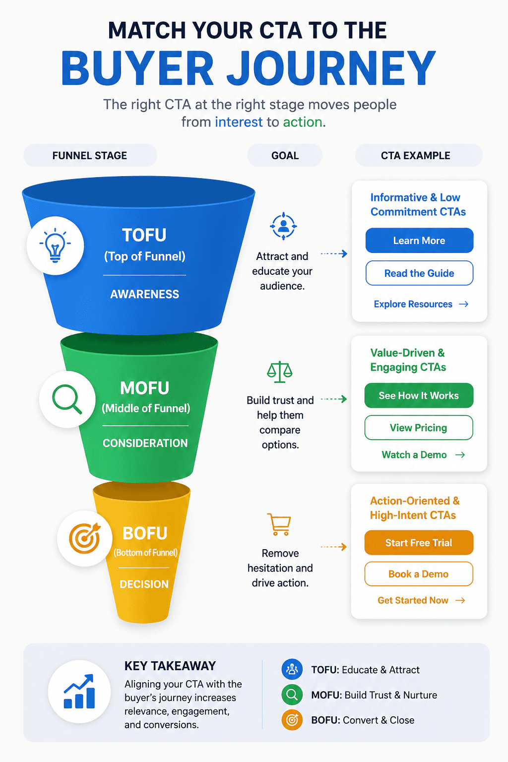
When And Where To Use A CTA?
Don’t make the mistake of putting the CTA everywhere. An effective Call To Action should appear whenever a user reaches a decision point. It means placing it where intent is strongest.
On a landing page, the CTA should appear after the value is clearly explained and again after objections are addressed.
In a Google ad, the CTA must align with the search intent behind the keyword. If someone searches for pricing, the CTA should guide them toward pricing, not a generic contact form. In content marketing, CTAs work best after delivering real insight, not before.
Timing matters as much as placement. A user who just discovered your brand may respond to “Learn More,” while a high-intent visitor is more likely to click “Book a Demo” or “Start Free Trial.”
A strong Google Ad strategy depends on matching the CTA to the funnel stage.
Follow this simple rule: Use a CTA when the user has enough clarity to act. If the message builds trust and removes friction, the CTA feels natural rather than forced.
5 Types of CTAs
Choosing the wrong type of CTA is a common Google ad mistake that weakens conversions even when traffic is strong. Understanding which type to use at each stage of the funnel makes a direct impact on performance.
CTA Type | Example | Description |
Action-Oriented CTA | Sign Up | This CTA is used when the goal is immediate movement. It works best for users who already understand the value and just need a clear next step to commit. |
Information CTA | Learn More | This CTA lowers pressure. It gives curious visitors a way to explore further without forcing a decision too early in the funnel. |
Social Sharing CTA | Join Us | This CTA builds connection rather than conversion. It is about growing community, visibility, and brand engagement over time. |
Feedback CTA | Leave A Review | This CTA appears after value has been delivered. It turns satisfied users into proof, which strengthens trust for future buyers. |
Personalized CTA | Recommended For You | This CTA feels tailored. It responds to user behavior and makes the next step feel relevant instead of generic. |
How To Write A CTA: 7 Actionable Tips
The difference between average and high-performing campaigns often comes down to how the CTA is written. Here are 7 actionable tips for you.
Have A Clear Goal
Your CTA should have one purpose. So, if the page is about booking demos, the CTA should not suddenly push a newsletter. This only leads to confusion and that kills momentum. Healthy landing page practices always align the CTA with the single most important action on that page.
Create A Sense Of Urgency
Human beings procrastinate actions by habit. A subtle sense of urgency helps them act now instead of “later.” Don’t mistake it with adding fake countdown timers. It means you should use clear framing like “Start Your Free Trial Today” or “Limited Spots Available.” Urgency should feel real, not manipulative.
Use Actionable Words
Weak verbs create weak results. For example, “Submit” feels passive. But “Get My Plan” feels active. Use decisive language in your CTA as they signal towards an action. Action-oriented copy essentially reduces hesitation, increasing clicks. This happens because it feels direct and confident.
Create Value
A CTA should communicate what the user gains, not just what they need to do. This is especially important in B2B funnels where intent is layered. When working through PPC keyword research for B2B SaaS, high-intent keywords perform better when the CTA reflects a clear outcome, not just a generic action.
Be Absolutely Clear
Don’t try to be clever. Simply be clear in your CTA. If a user has to think about what happens next, the CTA has already lost power. A strong call to action answers three questions instantly: What am I getting? How long will it take? What happens next?
Give Importance To Placement
A great CTA in the wrong place will not convert. To make a CTA work, make sure your CTA placement matches intent. High-intent users don’t usually have the patience to scroll endlessly to find the CTA button. Strategic placement is the most important part of conversion rate optimization. Even small positioning changes can significantly impact performance.
Test Variations
No CTA should be treated as final. Small wording changes can shift results dramatically. “Book A Demo” might outperform “Schedule A Demo.” It is important to test copy variations consistently just to see how campaigns improve over time.
Conversion-Focused Call-to-Action Phrasing for Ad Copy
Ad copy CTAs operate under different constraints than landing page or email CTAs. You have limited characters, zero context from surrounding content, and a reader who is mid-scroll or mid-search. The CTA in an ad has to carry the full weight of intent signal, benefit communication, and action direction, in five words or fewer.
Most ad CTAs underperform not because the offer is weak, but because the phrasing is generic. "Learn More" and "Get Started" appear in an estimated 70% of digital ads. They convert below average because they say nothing about what happens next or why it is worth clicking.
The strongest ad copy CTAs do three things in very few words: they name an outcome, reduce perceived effort, and match the search intent of the person seeing the ad.
CTA for High-Intent Bottom-Funnel Ads (demo, trial, purchase)
CTA Phrase | Why It Works |
Book Your Free Demo | "Free" removes cost friction. "Book" signals a real commitment, which pre-qualifies clickers. Outperforms "Request a Demo" consistently in B2B SaaS. |
See It in 15 Minutes | Removes the fear of a long sales process. Sets a specific time expectation. Works well for SaaS products with a fast time-to-value. |
Start Free — No Credit Card | Two friction removals in one CTA. Free entry point + no payment risk. Standard best practice for PLG SaaS trial CTAs. |
Get a Custom Quote | Works for high-ACV products where price is a barrier to entry. "Custom" signals that the conversation will be relevant to their situation. |
Claim Your Free Audit | "Claim" implies something reserved or limited. Works well for service businesses and agencies. Converts better than "Request an Audit" because it frames the value as already belonging to the reader. |
CTA for Mid-Funnel Consideration Ads
CTA Phrase | Why It Works |
See How [Company] Reduced CAC by 40% | Social proof embedded in the CTA. Speaks to a specific outcome the reader wants. Works in display and remarketing ads. |
Compare All Plans | Meets the reader where they are (evaluation stage). Non-pushy. Converts well when someone is actively comparing options. |
Read the Case Study | Lower commitment than a demo CTA. Works well for warming up B2B buyers who are not yet ready to talk to sales. |
Watch the 2-Minute Demo | Specific time investment stated upfront. Dramatically reduces friction for video demo CTAs. "2-minute" converts better than "short" because it is concrete. |
CTA for Top Of The Funnel Marketing and Awareness Ads
CTA Phrase | Why It Works |
See Why 10,000+ Teams Switch | Social proof with scale signal. Works at the awareness stage because it creates curiosity without demanding commitment. |
Discover a Better Way | Vague enough for broad audiences, but implies dissatisfaction with the current solution. Useful for cold audiences not yet aware of your product category. |
Get the Free Guide | Low-friction content offer. Works well for top of the funnel marketing campaigns where the goal is email capture, not immediate conversion. |
One thing most teams miss: your ad CTA and your landing page CTA must be in sequence, not just matched. The ad CTA sets an expectation. The landing page CTA must fulfill it and advance it. If your ad says "Book a Free Demo" and the landing page CTA says "Get in Touch," the disconnect creates friction that kills conversion before the visitor even reads the page.
30+ Best Call-to-Action Examples
Below are real-world CTA examples that convert because they match platform behavior, audience mindset, and buying stage.
Landing Page CTA Examples
These CTA examples show how brands guide visitors toward a clear next step once value has been established on the page.
Brand | CTA | Why It Works |
Shopify | Start Free Trial | Shopify places this CTA above the fold and reinforces it throughout the homepage because the entire page builds toward trial signup. The word “Start” signals action, while “Free Trial” removes financial hesitation. It aligns perfectly with users evaluating ecommerce platforms who want to test before committing. |
Slack | Try for Free | Slack uses this CTA to keep onboarding feel simple and low-pressure. The word “Try” reduces commitment anxiety and makes the step feel reversible, which works well for first-time SaaS users exploring options. |
Notion | Get Notion Free | Notion combines branding with benefit by including the product name in the CTA. This strengthens recall while “Free” lowers friction. The message feels safe, clear, and immediate. |
Best Call-to-Action Examples for a Lead Capture Page
A lead capture page has one job: turn a visitor into a contact. That means the CTA carries more weight here than on almost any other page type. There is no product to sell yet. No checkout to complete. Just a single moment where the visitor decides whether what you are offering is worth their name and email address.
The CTA on a lead capture page needs to answer one question the visitor is silently asking: "What do I actually get?"
Generic CTAs like "Submit" or "Sign Up" fail here because they communicate process, not value.
The best CTAs on lead capture pages name the outcome. Here are examples that consistently perform across B2B and SaaS lead capture pages:
CTA | Why It Works |
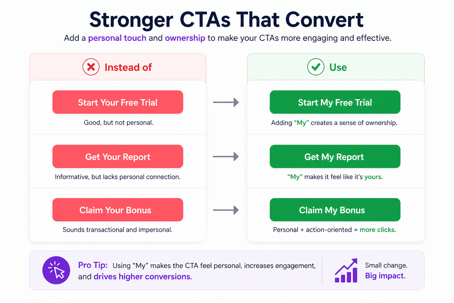
Get My Free Growth Plan | "My" makes it feel personalized. "Free" removes risk. "Growth Plan" names a specific outcome rather than a vague next step. |
Send Me the Guide | First-person phrasing ("me") shifts the perspective from brand to visitor. It feels like the visitor is choosing to receive something, not submitting to a form. |
Unlock the Free Template | "Unlock" implies hidden value waiting for them specifically. Works well for content upgrades and gated tools. |
Start Getting Better Leads | Benefit-led. Speaks directly to the outcome, not the action. Converts well for B2B SaaS with a clear pain point. |
Yes, Show Me How | Conversational and low-friction. "Yes" is a micro-commitment that primes agreement before the click. Reduces hesitation. |
Reserve My Free Spot | Scarcity + ownership. Used well for webinars, audits, or limited-intake offers. |
Get Instant Access | Speed matters. "Instant" removes the fear of a slow or complex process, which is a major friction point on lead capture forms. |
One thing to get right alongside your CTA: the landing page copy surrounding it. A strong CTA sitting inside weak copy will not convert. The headline, subheadline, and bullet points on the page must do the work of building enough value and trust that the CTA feels like the natural, obvious next step instead of a demand.
Best Advertising Call-to-Action Examples for a Referral Page
Referral pages operate on a different psychology than standard lead capture or demo pages. The visitor is already a customer or a warm contact.
This means that they are not evaluating whether to trust you. They are deciding whether to put their own reputation on the line by recommending you to someone they know.
That changes everything about how the CTA should be written.
A referral CTA needs to make the act of sharing feel easy, rewarding, and low-risk to the referrer. It also needs to make the offer feel valuable enough that they actually want to share it.
Weak referral CTAs treat sharing as a transaction. Strong referral CTAs treat it as a mutual win.
If you want to understand what makes a referral page work structurally before you optimize the CTA, our breakdown of best referral page examples covers the full page design across 25 real brands.
Here are advertising call-to-action examples that work specifically on referral pages:
CTA | Why It Works |
Invite a Friend, Get $20 | Concrete reward stated upfront. No ambiguity about what happens. The referrer knows exactly what they and their contact receive before they click. |
Share and Both Save | "Both" is the key word. It frames the referral as generosity, not self-interest. Removes the hesitation of feeling like you are benefiting at someone else's expense. |
Give $10, Get $10 | Symmetry builds trust. Equal-value offers convert better than one-sided rewards because they feel fair to both parties in the referral loop. |
Send This to Someone Who Needs It | Removes the transactional feel entirely. Works well for software products that solve a specific pain point. The referrer becomes a problem-solver, not a promoter. |
Refer a Colleague — Earn 1 Month Free | B2B-specific. "Colleague" is more appropriate than "friend" in a professional context. The reward (a month free) is tied to the product, reinforcing its value. |
Help a Friend Get Started | Framed as assistance, not promotion. This CTA works when the product has strong user satisfaction and customers genuinely want others to have the same experience. |
Claim Your Referral Reward | The word "claim" implies something already earned, waiting to be collected. Drives urgency without fake countdown timers or pressure tactics. |
Referral pages also benefit significantly from retargeting ads campaigns that bring back users who visited the referral page but did not complete the share action. A well-timed retargeting ad with a benefit-forward CTA, such as, You left $20 on the table, consistently recovers referral conversions that would otherwise be lost.
Click-Through Rate (CTR) Examples
Let’s look at examples that focus on wording that increases clicks by matching user intent and reducing hesitation before engagement.
Brand | CTA | Why It Works |
Canva | Create Your Design Now | Canva uses this CTA in ads and landing pages to promise immediate action. The phrase suggests users can start creating instantly, and the word “Now” adds urgency without feeling pushy. That combination helps increase click-through rates. |
Grammarly | Add to Chrome — It’s Free | Grammarly directly addresses hesitation by highlighting that the tool is free. By removing cost concerns inside the CTA itself, it reduces friction before the click, which improves ad engagement and CTR. |
Duolingo | Get Started | Duolingo keeps its CTA simple because it targets a broad audience. “Get Started” feels easy and low-pressure, which lowers the barrier to entry and encourages more users to click. |
Google Ads CTA Examples
Look at these CTAs. They are designed for high-intent search users who are actively looking for solutions, not casually browsing.
Brand | CTA | Why It Works |
Monday.com | Get Started | Monday.com uses this CTA in Google Ads targeting work management and project software searches. Users at this stage are problem-aware and actively looking for solutions. “Get Started” feels immediate and professional without implying heavy commitment. |
Salesforce | Start Your Free Trial | In paid search campaigns around CRM software, Salesforce highlights “Free Trial” to reduce perceived risk. This CTA provides a low-barrier entry point. It performs well because it reassures users before they commit. |
HubSpot | Get a Demo | HubSpot uses this CTA for comparison and alternative-based search terms. At this stage, buyers want proof and guided exploration. “Get a Demo” offers structured insight rather than generic information, which improves lead quality and aligns with bottom-of-funnel intent. |
Facebook Ads CTA Examples
The following examples reflect how CTAs perform in social feeds where attention is short and decisions are often emotional.
Brand | CTA | Why It Works |
Airbnb | Book Now | On Facebook, users are browsing casually and reacting emotionally to visuals. Airbnb’s “Book Now” captures that impulse immediately. It shortens the gap between inspiration and action, which is critical on social platforms. |
Spotify | Sign Up Free | Spotify includes “Free” directly in the CTA to remove cost hesitation before it appears. On Facebook, where attention is short and decisions are quick, lowering resistance increases conversions. |
MasterClass | Join Now | MasterClass frames the action around belonging rather than buying. “Join Now” feels like becoming part of a community, which performs well on Facebook where identity and interests drive engagement. |
E-Commerce CTA Examples
E-commerce CTAs are designed for buyers who are close to purchase (BOFU) and need clarity, speed, and minimal friction.
Brand | CTA | Why It Works |
Amazon | Add to Cart | Amazon keeps the CTA simple because buyer intent is already high. The clarity reduces friction at checkout, and the familiarity of the phrase builds trust and speeds up purchase decisions. |
Nike | Shop Now | Nike uses this CTA to move users from browsing into product exploration. It creates forward momentum without pressuring the user into an immediate purchase. |
Glossier | Add to Bag | Glossier softens the traditional “Add to Cart” language to match its lifestyle branding. It feels natural and less transactional while still guiding users toward conversion. |
Secondary CTA Examples
These examples support users who are not ready for the primary action but still want to explore further. You can say, they are at the MOFU stage, and doing their research before committing to anything.
Brand | CTA | Why It Works |
HubSpot | See Pricing | This CTA supports users who are not ready to book a demo but want cost clarity. It captures mid-funnel intent and prevents potential customers from leaving due to unanswered pricing questions. |
Stripe | View Documentation | Stripe knows its audience includes developers who require technical detail before committing. This CTA respects that process and provides validation before asking for a conversion. |
Asana | Learn More | Asana uses this CTA for visitors who are still exploring. It allows users to gather more information without pressure, keeping engagement high without forcing an immediate commitment. |
5 Examples of Weak CTAs
1. “Submit”
“Submit” is still widely used on contact forms and gated content pages. While it looks functional, it doesn’t add any value. Think about it, when was the last time users woke up wanting to submit something. They look for results.
Why it is weak:
It focuses on the action itself instead of the outcome. A CTA button should communicate what the user gets, not what they are doing.
2. “Click Here”
“Click Here” often appears in blogs, emails, and banner ads across many websites. And the real truth is that it provides zero context about what happens next.
Why it is weak:
The CTA on its own is vague and provides zero direction to the users. In conversion-focused environments, especially landing pages and Google Ads funnels, lack of clarity lowers click-through rate and reduces trust. Users don’t want to guess.
3. “Learn More” (At High-Intent Stage)
“Learn More” is common on product and pricing pages. While it works in early discovery, it becomes weak when users are already evaluating a solution.
Why it is weak:
At high intent stages, users want direction, not exploration. A stronger CTA would guide them toward a demo, trial, or pricing action.
4. “Contact Us”
This CTA is extremely common on service websites. And guess what, it feels super formal and vague.
Why it is weak:
It does not explain the benefit of reaching out. Compare “Contact Us” with “Get Your Free Strategy Call.” The second version communicates value and reduces hesitation.
5. “Buy Now” (Used Too Early)
“Buy Now” works in ecommerce when intent is high. However, when shown to cold traffic or first-time visitors, it feels a bit abrupt.
Why it is weak:
It pushes for commitment before trust is built. Without proof, clarity, or context, aggressive CTAs increase bounce rates.
Genius CXL Call-to-Action Examples
CXL is one of the most cited references in conversion optimization.
Their approach to CTAs is worth studying, not because they invented new principles, but because they documented what actually happens when you test CTA variables at scale.
What their research consistently shows is that most CTA improvements come from removing friction, not from clever copywriting.
Here are the CXL-backed CTA principles that hold up across their published tests and examples of how they translate into real phrasing:
1. First-person phrasing outperforms second-person phrasing
2. Specificity outperforms generosity in CTA copy
3. Button color matters less than button contrast
4. CTAs below the fold outperform CTAs above the fold — on long pages
5. Reducing options increases conversion
The best call-to-action examples in high-converting B2B SaaS pages apply this principle: one primary CTA dominates visually, any secondary CTA is a text link rather than a button, and the page is designed so both options feel like a natural next step rather than competing demands.
The Bottom Line
Strong calls to action are not about clever wording. They are about clarity, timing, and intent. For example, the difference between “Submit” and “Start Your Free Trial” may look small, but in real campaigns, those small shifts change conversion rates in a measurable way.
Every high-performing funnel has one thing in common: the CTA matches the stage of the buyer and the promise made earlier. So, when that alignment is missing, even great ads and strong landing pages underperform.
If you are running paid campaigns and want your CTAs to do more than just sit on a page, the strategy behind them matters. At Scalix AI, we help SaaS, AI, and tech brands build PPC and Google Ads systems that turn intent into action. If your traffic is not converting the way it should, it may be time to fix the message behind the button.
Your ads are driving clicks. Are your CTAs turning them into pipeline?
One weak CTA kills the conversion your ad earned.
Get a Free Audit →
How Do You Write A Call To Action?
What Is An Inspiring Call To Action?
What Is A Short Call To Action?
What Is A Good Call To Action Example?
