


IN THIS ARTICLE:
Key Takeaways
1
The best referral page examples convert because the value exchange is instantly clear.
2
Referral traffic arrives with borrowed trust, so your job is to remove the last hesitation.
3
One-click sharing isn't optional. Every extra step cuts the participation rate measurably.
4
Referred customers retain 37% longer — referral pages are high-LTV acquisition, not just growth hacks.
If you’re looking for the best referral page examples, chances are you’re not just browsing for inspiration, you’re trying to figure out what actually works and how to replicate it.
And that’s fair, because referral pages are one of those things that look simple on the surface but quietly drive a disproportionate amount of revenue when done right.
Think about it like this: people don’t trust ads nearly as much as they trust other people. In fact, according to Nielsen, 83% of consumers trust recommendations from friends and family over any form of advertising.
So when someone lands on your referral page, they’re not cold traffic. They’re already warmed up. The intent is there. The trust is borrowed. The only thing left is conversion.
And that’s exactly what this guide is about.
We’re not just showing you referral page examples, but we’re also breaking down why they work, what makes them convert, and how you can build one that actually drives results.
Let’s get started.
TL;DR
This blog is all about how companies turn their users into marketers using referral pages. It walks you through real examples and explains what makes them effective, without overcomplicating things. So if you ever wanted to build one yourself, you’d know exactly what to do and what to avoid.
What is a Referral Page? (With Examples)
A referral page is simply a page where your existing users can invite other people and both of them get something in return.
That’s it.
It’s not complicated, and honestly, the best ones don’t try to be.
Usually, the offer looks something like:
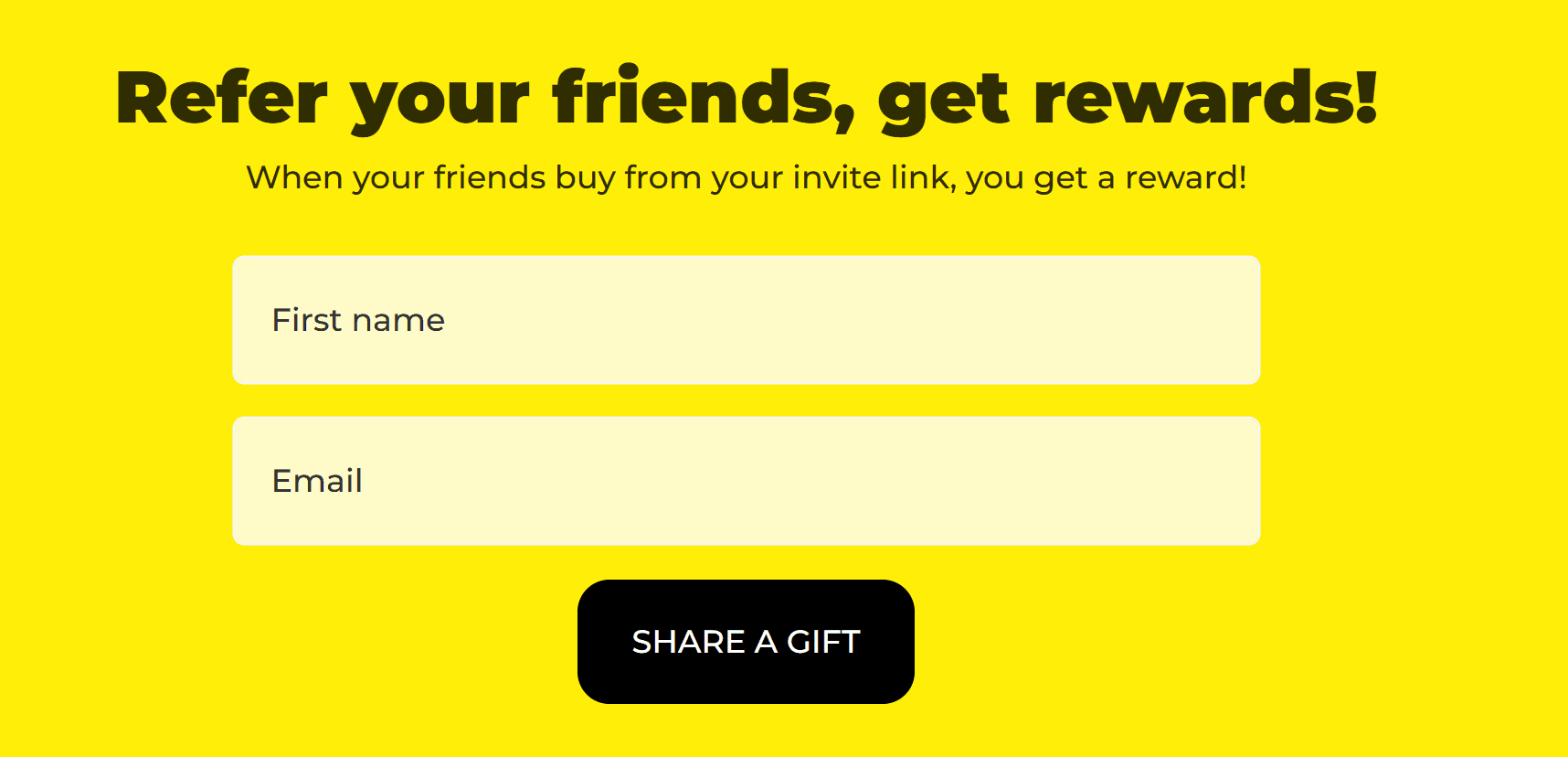
Give $10, get $10
Invite a friend, unlock credits
Refer someone, get a reward
So instead of you constantly trying to acquire new users, your customers start doing it for you. And that completely changes the game because now you’re not just relying on top of the funnel marketing in Google Ads to bring people in. You’re actually turning your existing users into a growth channel. And that’s a big victory lap moment for you.
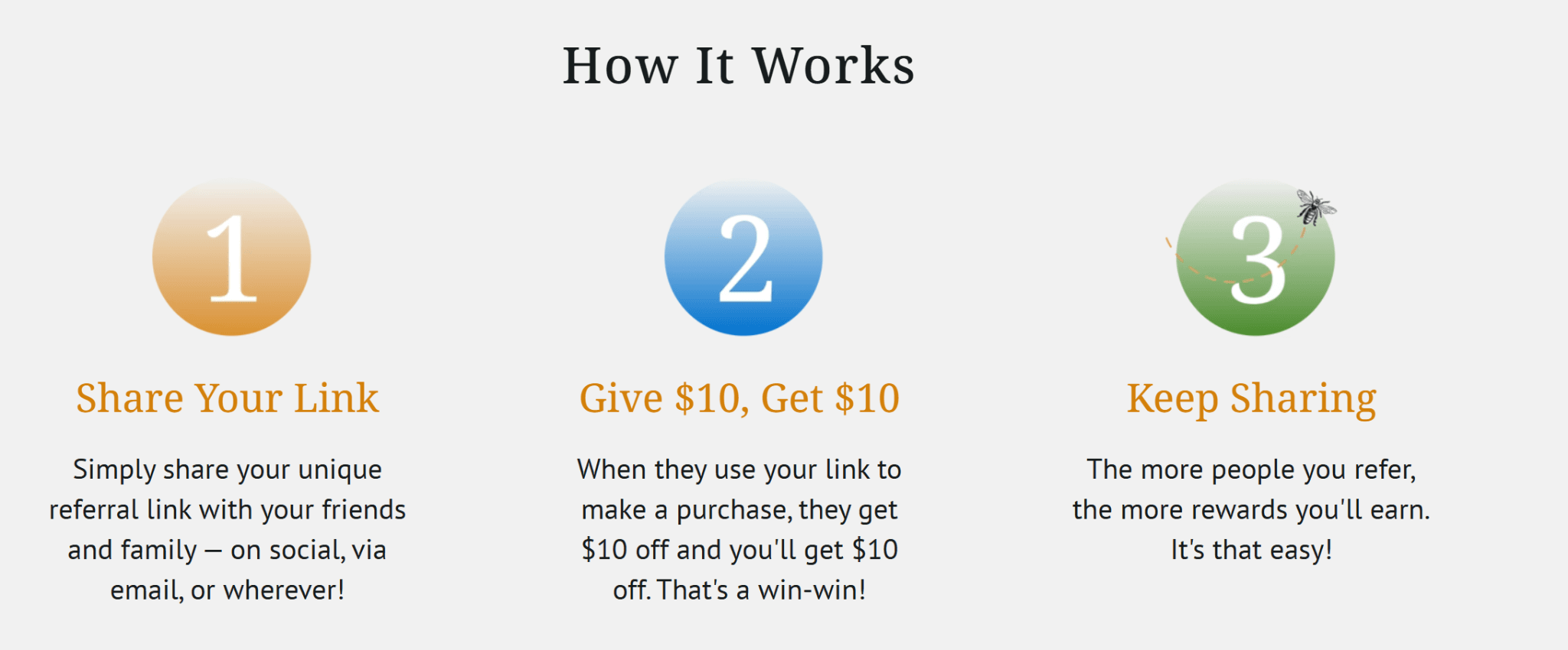
Now you may wonder how it all works? Well, here’s what actually happens behind the scenes:
Step 1: Someone lands on your referral page
Step 2: They get a personal referral link or code
Step 3: They share it with a friend (WhatsApp, email, wherever)
Step 4: The friend signs up
Step5: Both of them get rewarded
It’s a simple loop, but it scales really fast when done right.
And you’ve definitely seen this before, even if you didn’t realize it at the time. Think of every time you came across the following offers:
“Give $10, get $10” offers from apps
Invite-a-friend popups in SaaS tools
Referral credits in fintech or e-commerce products
The thing is, good referral pages don’t behave like some special category of page. It behaves like a really good landing page because the same rules apply here, too. It requires a clear offer, strong incentive, no confusion, and absolutely no extra steps.
In fact, if you follow solid landing page best practices, you’re already halfway there.
The only difference is the intent.
People landing on a referral page are already coming in with a layer of trust. So, your job is not to convince them from scratch, rather it’s to make saying “yes” feel obvious.
Why Referral Pages Work (Backed by Data)
Let’s ground this in reality for a second, because referral marketing can be one of the most powerful growth levers you can build. Here’s why:
People trust people more than brands
97% of people trust online reviews as much as personal recommendations. What this means is that you’re not starting from ground zero. You’re starting with trust already transferred.
Word-of-mouth drives real revenue
This is where it gets even more interesting. Word of mouth drives 20% to 50% of all purchasing decisions. Don’t think of this as a small percentage. Because you are looking at a massive chunk of your potential revenue. Instead of thinking of a referral page as an experiment, go into it knowing this will bring in a massive load of revenue.
Conversations scale faster than ads
There are 2.4 billion brand-related conversations happening daily in the U.S. So, even if you’re running campaigns using the best PPC spy tools or refining your PPC keyword ideas you’re still competing for attention. In that case, referral marketing doesn’t compete, it spreads.
Referred customers convert better and stay longer
Referred customers have a 37% higher retention rate, bringing in higher lifetime value. So, you’re not just getting more users, you’re actually getting better ones.
Anatomy of a High-Converting Referral Page
Most blogs end up giving you surface-level advice. But if you really want to build something that converts, you need to understand what actually goes into a high-performing referral page.
Let’s break it down component by component.
1. Clear Value Proposition
The moment someone lands on your referral page, they should instantly understand two thing:
What do I get?
What does my friend get?
You don’t want to leave any room for confusion. The best copy is one that requires zero decoding. So, if you wish to create an excellent referral page, here’s a simple structure to follow: “Give X, Get Y”
That’s all you need to do because if someone has to think, you’ve already lost them.
2. Strong Call-to-Action (CTA)
Your CTA is where the conversion happens, so it needs to be obvious, specific, and impossible to miss. Here are some good Call to Action examples in referral pages:
Invite Friends
Get Your Link
Start Referring
Just know that it’s clarity instead of creativity that makes them work.
And guess what’s even more important? It’s going to be their placement. You want the CTA to appear above the fold and right after the value proposition. Also, you want to repeat it throughout the page so that it becomes impossible to miss.
3. Incentive Structure (This is Everything)
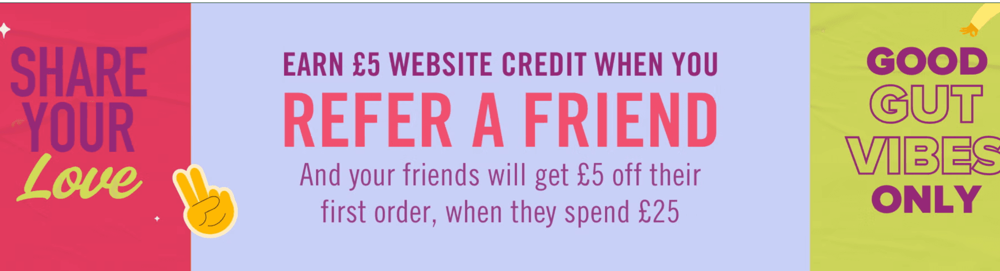
If your incentive is weak, nothing else matters.
High-performing referral pages usually use immediate double-sided rewards so that both users benefit from it. Also, their offer is simple and easy to understand.
For example: Give $10, Get $10
Trust me when I tell you it works better than complicated tier systems. Why? Because it doesn’t require any thinking.
4. Seamless Sharing Experience
Now this is where most referral pages quietly fail. If the sharing requires multiple steps or a complicated system, people are just not going to do it.
The best referral pages include:
One-click copy link
Pre-written messages
Direct sharing option for WhatsApp, email, and socials
The fewer the steps, the higher the participation rate will be.
5. Social Proof & Trust Signals
Even though referrals come with built-in trust, reinforcement still matters. Strong referral pages include:
Testimonials
User counts
Brand credibility signals
You need strong reinforcement as it helps remove the last bit of hesitation.
6. A Clean, Distraction-Free Design
Don’t treat your referral page as your homepage. A referral page has one job to do. Make sure it includes no unnecessary links, has a clear visual hierarchy and requires minimal navigation.
Everything should guide the user toward one action: sharing.
7. Alignment With Intent
We keep coming back to this one point, but it is extremely important. Intent. If someone lands on your referral page from a campaign, paid traffic or through a friend’s link, the message you put forward will be the deciding factor. So, make sure it matches with their intent.
This is where performance marketing thinking comes in. Because whether traffic comes from referrals or campaigns, the same principle applies: Intent + clarity = conversion.
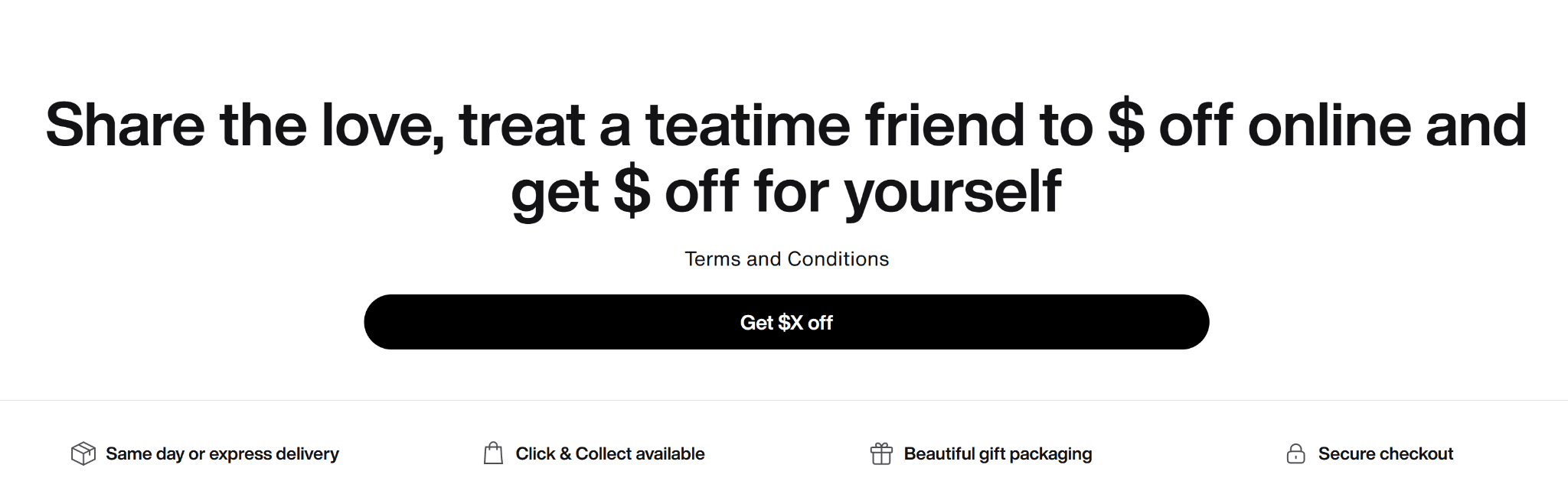
25 High-Converting Referral Page Examples
Let’s look at the best high-converting referral page examples.
Wren Kitchens
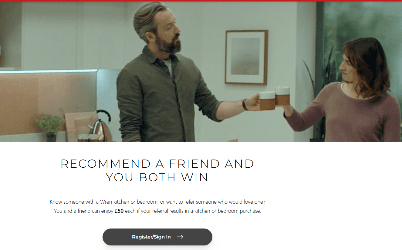
Here is the complete referral page: Wren Kitchens
Why this referral page works
The reward is framed around a high-value purchase, which makes the incentive feel meaningful, not trivial
The page clearly explains the process upfront, so users don’t have to figure out “what happens next”
It builds trust with a serious, no-gimmick tone, which matches the high-ticket nature of kitchens
Gymshark
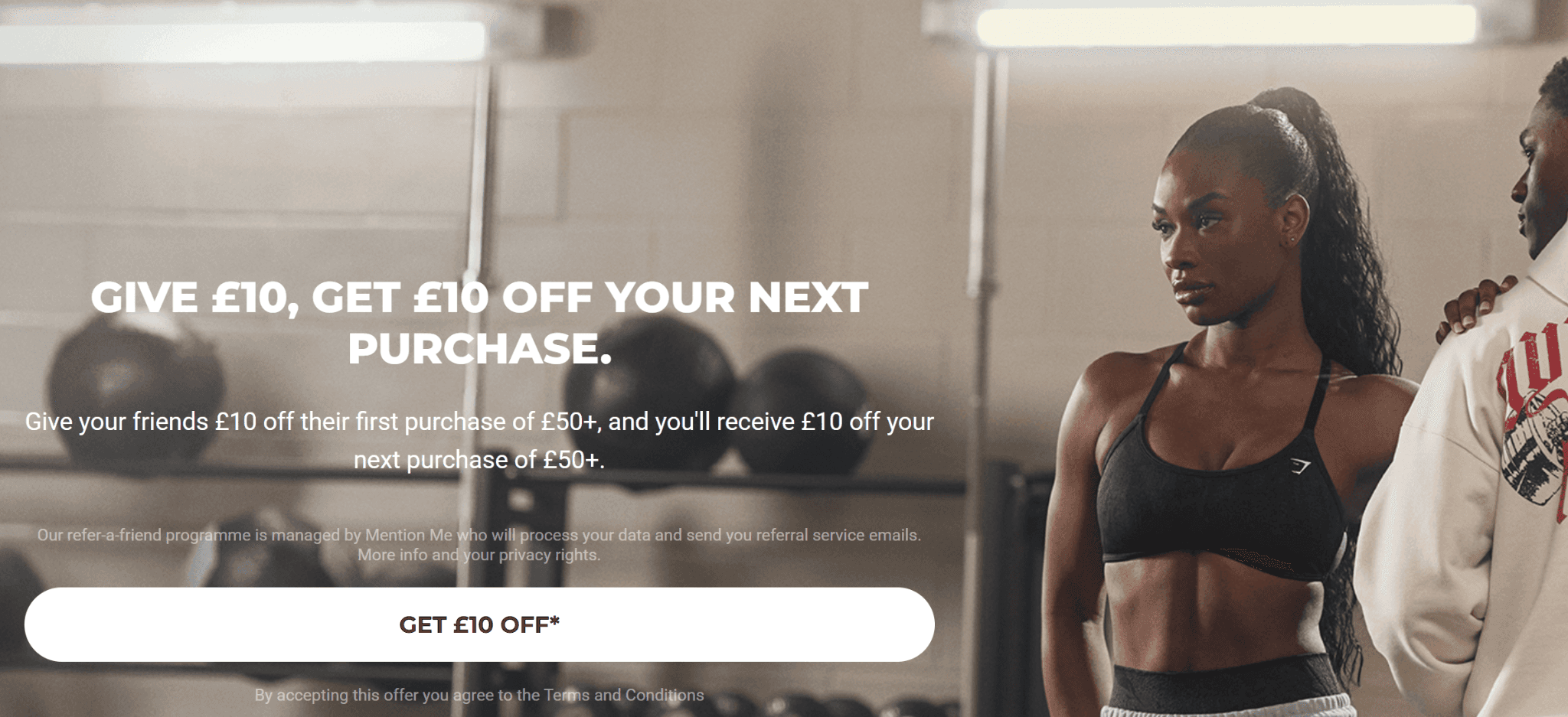
Here is the complete referral page: Gymshark
Why this referral page works
The page leans on brand familiarity and loyalty, so it doesn’t need heavy persuasion
The reward is simple and immediate, which lowers hesitation
The flow is tightly connected to the account experience, making sharing feel seamless
Rothy’s
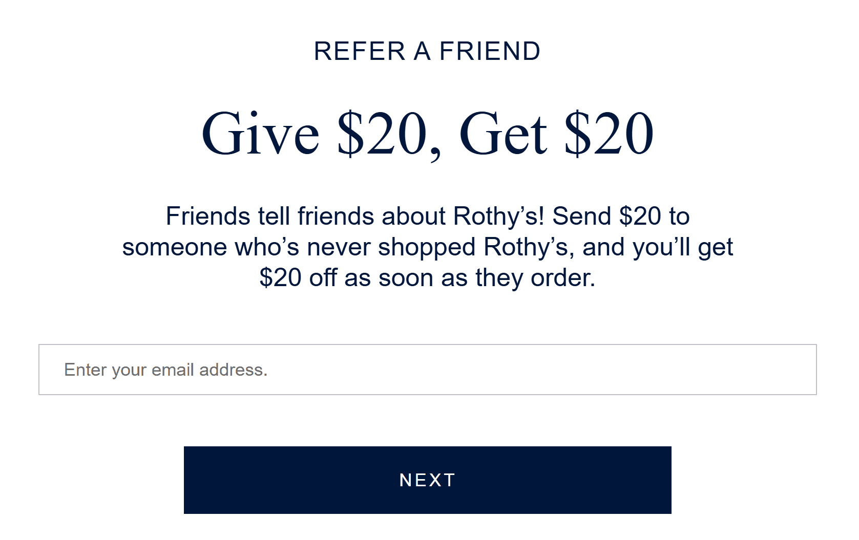
Here is the complete referral page: Rothy’s
Why this referral page works
The classic “Give X, Get X” framing is instantly clear and removes any confusion
The page design mirrors their product pages, so it feels consistent and trustworthy
The CTA is positioned right where the user expects it, no hunting required
JD Gyms
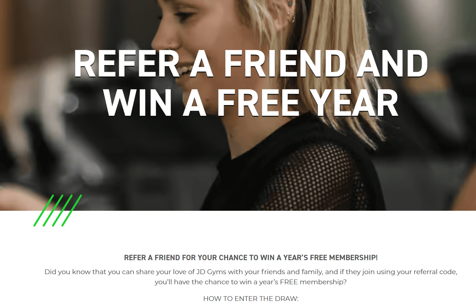
Here is the complete referral page: JD Gyms
Why this referral page works
The incentive is highly relevant to the audience, not generic
It taps into community motivation, which is strong in fitness environments
The process is explained in a very straightforward way, making participation feel easy
Piglet in Bed
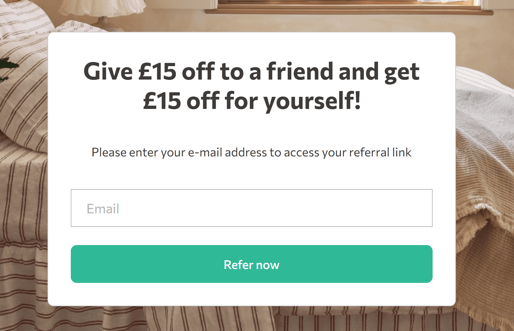
Here is the complete referral page: Piglet in Bed
Why this referral page works
The page uses a soft, lifestyle-driven tone that matches the brand perfectly
The offer is simple and positioned as a natural extension of the shopping experience
Clean layout keeps the focus entirely on the referral action
Anytime Fitness
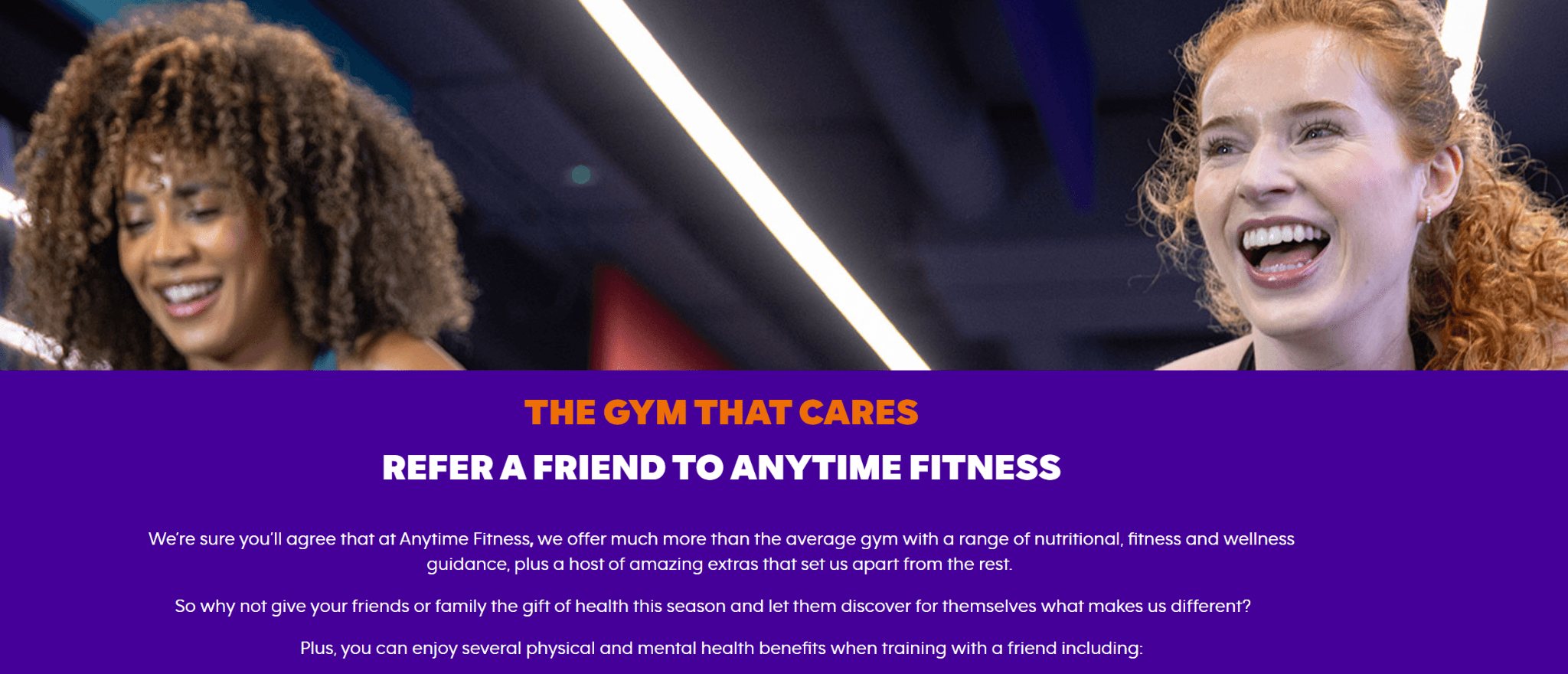
Here is the complete referral page: Anytime Fitness
Why this referral page works
The messaging focuses on inviting friends to a lifestyle, not just a transaction
The reward ties directly to fitness goals, making it feel relevant
The form-based approach reduces friction for users who just want to refer quickly
Tentree
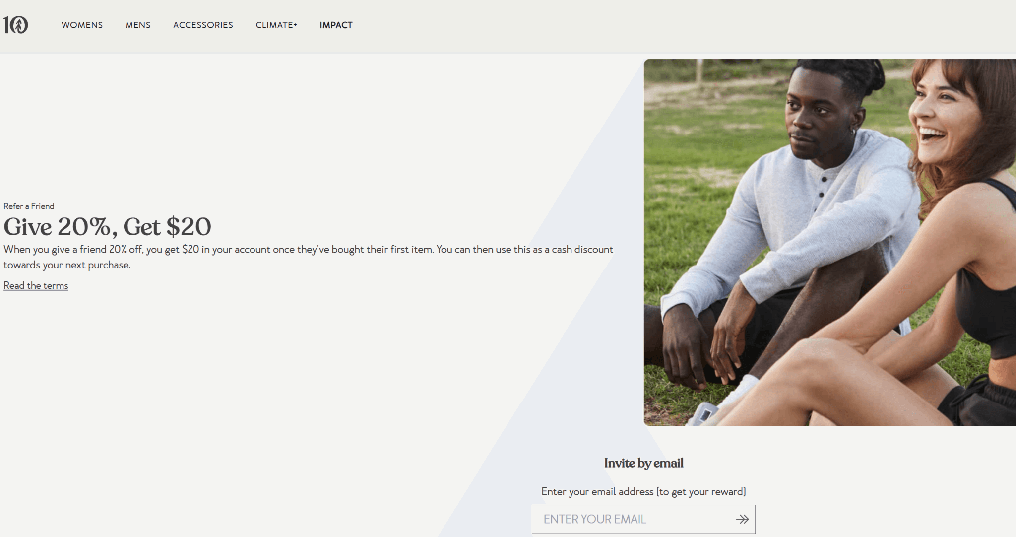
Here is the complete referral page: Tentree
Why this referral page works
The referral is tied to their mission (sustainability), which adds emotional motivation
The reward is clear without being too salesy, which fits their brand voice
The page keeps distractions minimal, guiding users straight to sharing
Trade Coffee
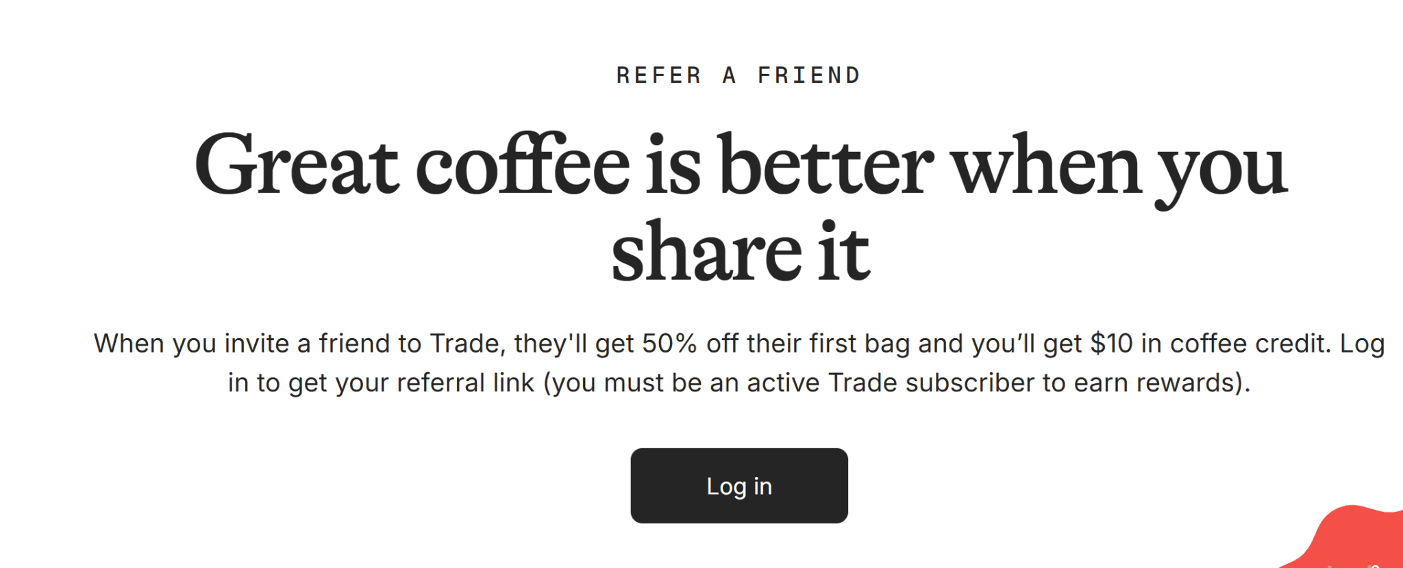
Here is the complete referral page: Trade Coffee
Why this referral page works
The referral is positioned as sharing a discovery, not just a discount
The page builds context around the product before asking for action
The flow feels premium and curated, which matches the brand
Blume

Here is the complete referral page: Blume
Why this referral page works
The messaging is friendly and relatable, which lowers resistance
The incentive is direct and clearly explained without overcomplicating it
The design keeps everything lightweight and easy to scan
. Rave Coffee
Here is the complete referral page: Rave Coffee
Why this referral page works
The referral is integrated into a rewards ecosystem, making it feel ongoing
The page explains earning clearly, which builds transparency
It encourages repeat engagement, not just one-time referrals
T2 Tea
Here is the complete referral page: T2 Tea
Why this referral page works
The tone feels warm and gift-like, which fits the product category
The offer is positioned as sharing something enjoyable, not selling
The layout is simple enough that users can act immediately
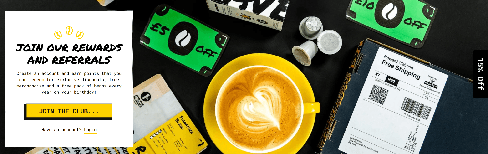
Bird & Blend Tea Co.
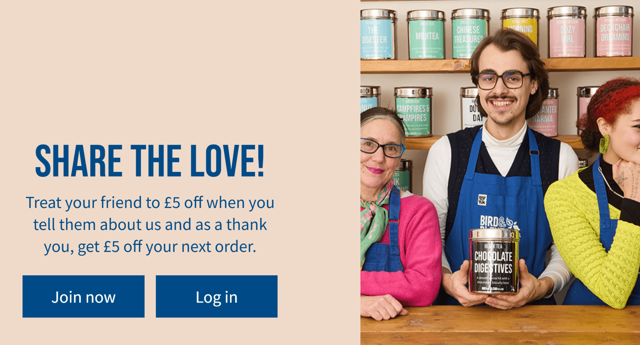
Here is the complete referral page: Bird & Blend Tea Co.
Why this referral page works
The brand personality comes through strongly, making it engaging
The reward is simple and clearly visible above the fold
The page feels community-driven, encouraging sharing
New English Teas
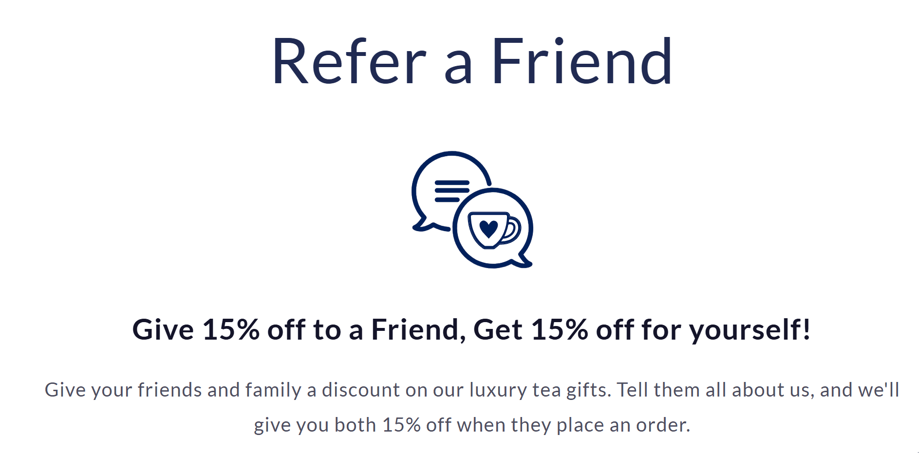
Here is the complete referral page: New English Teas
Why this referral page works
The offer is straightforward and easy to understand instantly
The page keeps things traditional and clean, matching the brand
There’s no unnecessary friction which encourages users to act quickly
Brooklinen
Here is the complete referral page: Brooklinen
Why this referral page works
The incentive is strong and clearly positioned early on
The page mirrors high-performing e-commerce landing pages
The CTA is obvious and repeated, reinforcing action
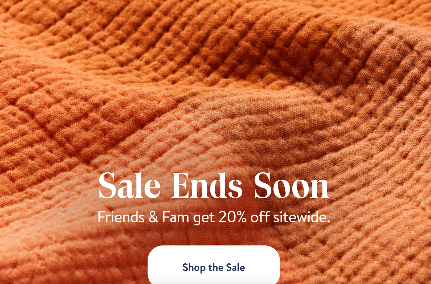
BRUU Tea Club
Here is the complete referral page: BRUU Tea Club
Why this referral page works
The subscription model makes referrals feel like sharing an experience
The reward is tied to continued engagement, not just one action
The page explains the process clearly in simple steps
Alohas
Here is the complete referral page: Alohas
Why this referral page works
The design is visually appealing but still focused on conversion
The offer is clean and easy to grasp immediately
The page keeps the journey short and frictionless
Ringtons Tea
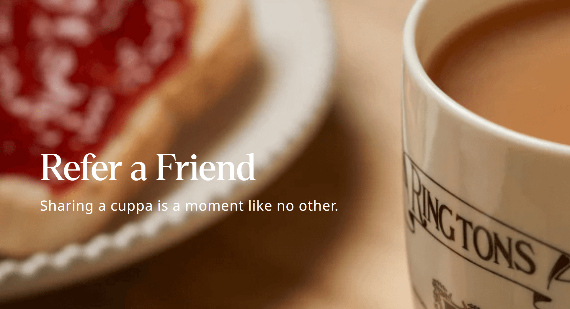
Here is the complete referral page: Ringtons Tea
Why this referral page works
The page uses a trusted, traditional tone, which builds credibility
The reward is practical and relevant to the audience
The structure is simple and easy to follow
TRIP Drinks
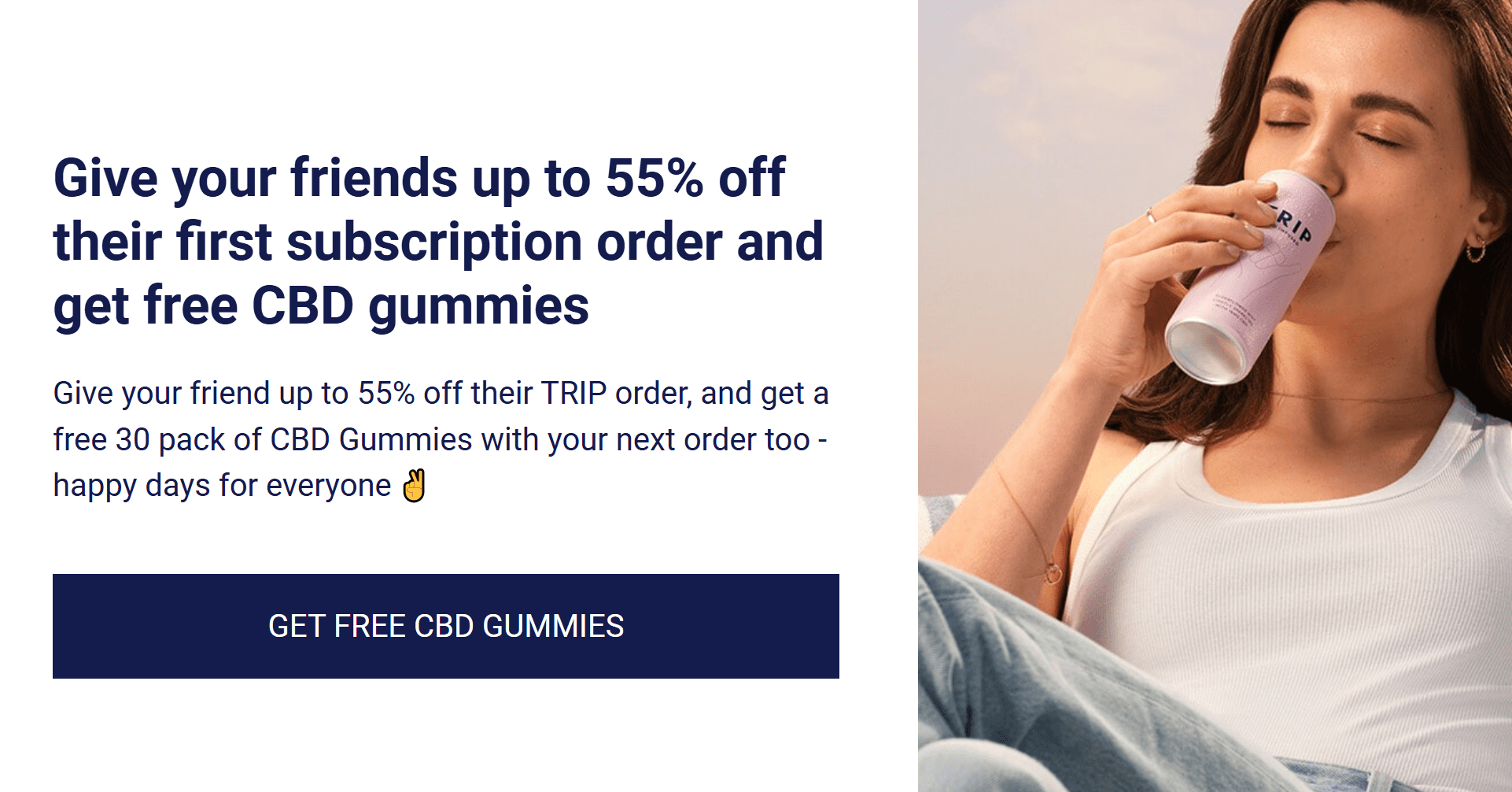
Here is the complete referral page: TRIP Drinks
Why this referral page works
The messaging is modern and aligns with the brand’s lifestyle positioning
The offer is clear and placed prominently
The page design makes sharing feel effortless
Bees & Trees
Here is the complete referral page: Bees & Trees
Why this referral page works
The referral is framed around product quality and trust, not just discounts
The page literally tells you the steps to refer a friend in a simple, step-by-step process
The incentive is easy to understand and act on
Hip Pop
Here is the complete referral page: Hip Pop
Why this referral page works
The tone is energetic and aligns with the brand personality
The reward is positioned clearly without clutter
The page encourages quick action with minimal friction
Selfish Drinks
Here is the complete referral page: Selfish Drinks
Why this referral page works
The messaging is playful, which makes the experience engaging
The offer is simple and clearly communicated
The page removes unnecessary steps, making sharing easy
AG1

Here is the complete referral page: AG1
Why this referral page works
The referral is tied to a premium product narrative, which increases perceived value
The page builds trust before asking for action
The incentive feels meaningful relative to the product price
Saalt
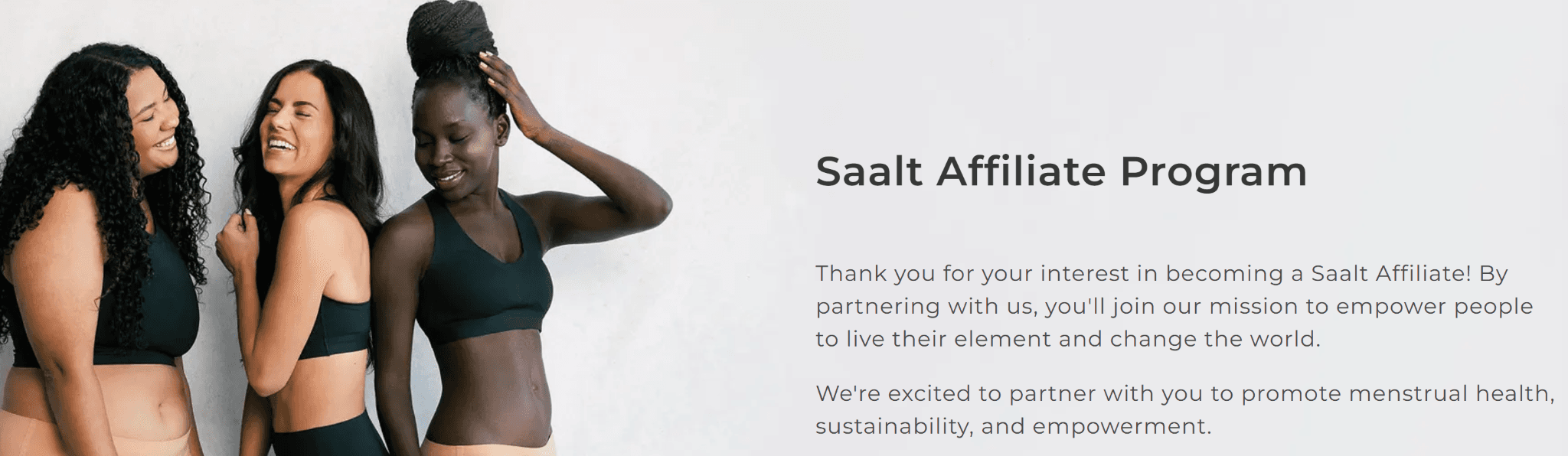
Here is the complete referral page: Saalt
Why this referral page works
The page keeps everything clean and distraction-free
The offer is positioned clearly with no ambiguity
The tone feels supportive and aligned with the brand
Starbucks
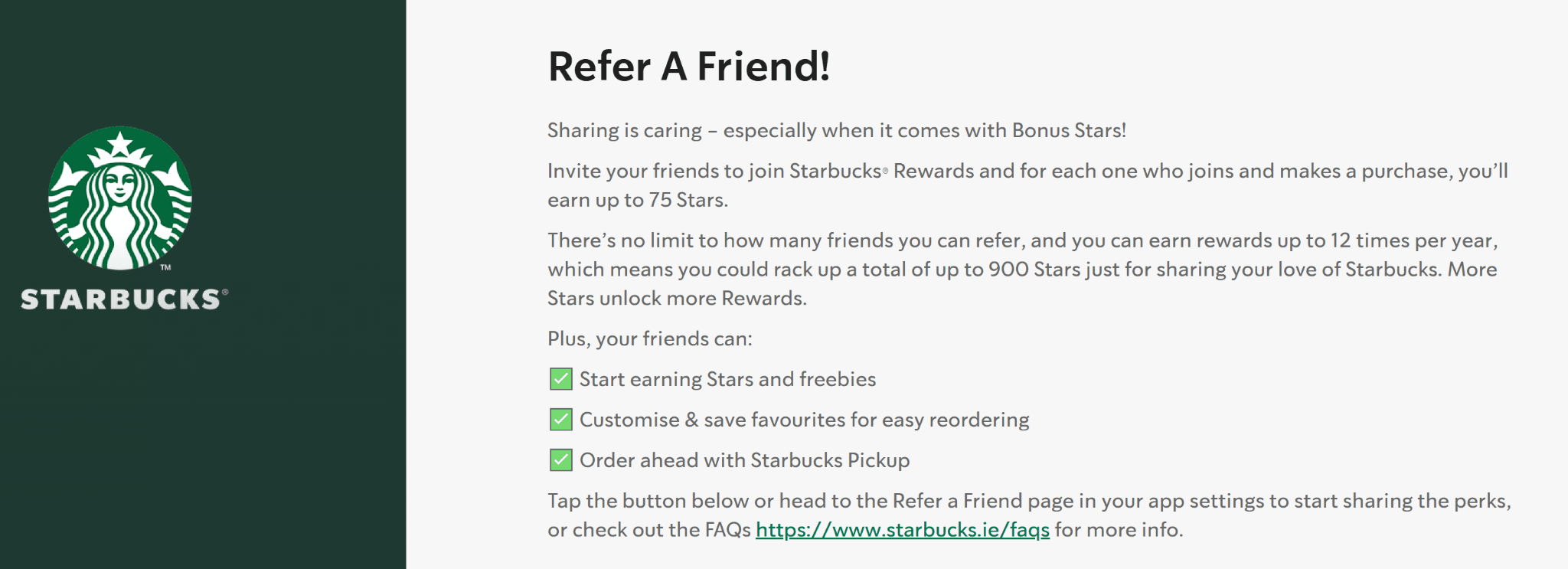
Here is the complete referral page: Starbucks
Why this referral page works
It uses an already strong loyalty ecosystem, making referrals natural
The reward ties directly into existing user behavior
The process feels integrated, not separate
Whittard of Chelsea

Here is the complete referral page: Whittard of Chelsea
Why this referral page works
The page clearly walks users through the process step by step
The offer is positioned as a shared benefit, not one-sided
The design balances tradition with clarity, making it easy to trust
How to Create a High-Converting Referral Page (3 Proven Tips)
Here are 3 tips that you need to apply to your referral page.
What to Focus On | What It Actually Means | What to Avoid |
Make the offer instantly clear | Your headline should answer “what do I get?” in one line (e.g., “Give $10, Get $10”) | Long explanations, hidden conditions, or complicated reward structures |
Reduce friction to near zero | Users should be able to copy or share their referral link in one click | Forms, multiple steps, or forcing signups before showing the benefit |
Match the intent of the visitor | Referral visitors already trust you—keep the tone natural and the page aligned with that | Overly salesy copy or treating them like cold traffic |
How Scalix AI Turns Referral Traffic Into Revenue
Here’s something most brands don’t think about: Getting referral traffic is one thing and converting it is another.
Because even if someone comes in through a friend’s recommendation, they’re still landing on a page. That page still has to do its job. And this is exactly where a lot of companies quietly lose conversions.
Building a referral program is not where the job ends. The page should be able to convert that traffic. So, if that page doesn’t match intent, doesn’t guide the user clearly, or just isn’t optimized to convert, having a referral page doesn’t matter.
Scalix AI doesn’t build referral programs. It focuses on what happens after the click.
We help companies:
Capture high-intent traffic through Google Ads
Align landing pages with user intent
Optimize conversion paths so traffic actually turns into revenue
So instead of chasing more traffic, we focus on making every visit count.
That’s how you turn referral traffic into something measurable and scalable.
The Bottom Line
Referral pages work because they remove the hardest part of marketing—earning trust.
You’re not convincing someone from scratch. You’re building on a recommendation that already exists.
And when you pair that with a clear offer and a frictionless experience, it becomes one of the simplest ways to drive consistent growth.
The examples we covered all follow the same principle: keep it obvious, keep it easy, and don’t get in the user’s way.
If you’re building your own referral page, focus less on being creative and more on being clear.
And if you want that traffic, whether from referrals or paid channels to actually convert, then the real work starts after the click.
That’s where strong landing pages, intent alignment, and the right Google Ads Management services make the difference between traffic that looks good on paper and traffic that drives revenue.
What are referral page examples?
What makes a referral page high-converting?
What should be included in a referral page?
Do referral pages actually increase conversions?
How do I create a referral page like the best examples?
